Tag: marketing

  • New Haven Pickleball’s Brand Promise: More Than Just a Game

    Image Source: Photograph taken by Steve Walter

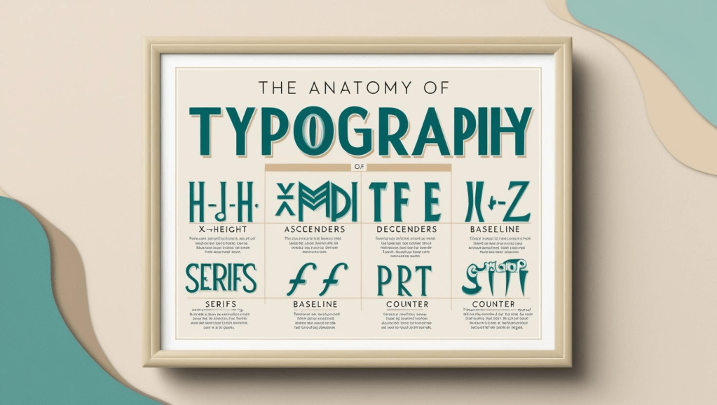
    At its core, all brands are a promise. Usually, the first thing that people picture when they hear the word “brand” is a logo, colors and some type of slogan. Gathering all these components together to tell people a story and effectively communicate whatever good or service you are selling is how you succeed in creating a successful brand that changes someone’s life. Taking this visual design course taught me to think about branding holistically from the perspective of a designer. Specifically, how every little decision whether it’s using a chunky serif font to evoke an assertive tone, choosing a balanced trio of colors, or creating a certain style of illustration on product packaging to target an audience; all these decisions add up to the total sum of what makes a brand memorable.  

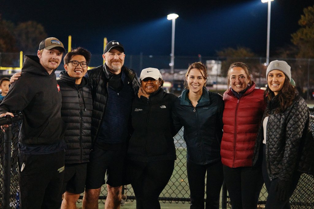
    The culmination of these design skills I learned over the last seven weeks is on display in the new brand guidelines I designed for New Haven Pickleball. This is a community to connect with local, fellow pickle-ballers. No matter if you are brand new to this brilliant game or prepping for the day it is in the Olympics, you are welcome! I discovered this community in the summer of 2024 and almost one year later, have met many incredible people that I play Pickleball with regularly. Creating brand guidelines for New Haven Pickleball was a fun, yet challenging process since the brand had no foundation to work off besides a name and a few social media pages. I’m going to take you through an aspect of the brand guidelines that is one of the most vital components to making this brand what it is.

    Verbal Brand

    Regardless of the company or organization, the anatomy of all brands has a verbal brand component. For New Haven Pickleball, all it had was name. When you really think about it, a verbal brand is so much more than a name, it’s your company’s slogan, personality, tone of voice, and style of language.

    After reading a chapter on branding from the book “Graphic Design For Everyone” by Cath Caldwell, I understood what all of these parts of a verbal brand meant. After thinking, research, and some trial and error, I decided to change the name of this company to NHV PB, created the slogan “Community > Competition”, and established its values are inclusivity, positivity, learning and passion.

    These decisions about NHV PB’s verbal brand set the tone moving forward for the copy I used on marketing collateral including an event poster, brochure about the spring league, and a home page design comp for a website mockup.

    The slogan, “Community > Competition” might be the most important aspect of NHV PB’s verbal brand. This company is mainly a community. The “good” it sells is the sense of belongingness, camaraderie, and the opportunity to consistency play pickleball. Using this phrase as a slogan that appears on print collateral, merchandise, and digital properties echoes inclusivity as a brand value and welcomes players at all levels while still validating the legitimacy and opportunity to progress and get better at pickleball.

    I look forward to learning more about visual design and the opportunity to potentially work with the league manager who created New Haven Pickleball to implement some of these brand guidelines.


    Sources

    Caldwell, C., & Skene, R. (2019). Graphic design for everyone: Understand the building blocks so you can do it yourself. Dorling Kindersley Limited.

  • From Lens to Canvas: Crafting Emotional Connections in Design

    Image Source: Generated by Google Gemini

    Conveying information to elicit an emotional response is one of the most powerful skills a designer can master. From photos to hand-drawn illustrations and even digital artwork, each form of imagery is a core component of graphic design. Something that stood out to me in this learning module is the juxtaposition of Illustration and Photography. Specifically, what illustrators can convey vs. photographers, the factors in the decision process illustrators go through when choosing a style, and the intersection of goals illustrators and photographers share. Let’s dive in!


    Photography: Capturing the Moment

    Photography is your best friend if you are trying to visually depict a product, establish a mood, and ultimately build a relationship with your target audience. A few of the most practical outcomes that photography creates for graphic designers are the ability to sell a product, establish trust, tell a story, or teach a technique.

    For my semester-long brand project, I am working on creating a visual and verbal “Brand DNA” for New Haven Pickleball, a local pickleball community I am part of. Using photography that captures pictures of people serving, dinking (a light touch hit in pickleball), and drop shots can showcase the wide variety of shots in pickleball and teach members of this community proper form for these different types of shots.


    Illustration: Carefully Crafted

    Illustration is typically a form of art that depicts a product or location. One of the most valuable aspects of illustration is its ability to convey abstract concepts. Because of its versatility, illustration usually enables designers to reach their target audience in ways that photography typically can’t. A few of the best examples are creating reality with personality, showing how, revealing what lies beneath, imagining prehistory and fantasy, and visualizing a complex idea.

    Continuing with the example of the New Haven Pickleball organization that I am doing my “Brand DNA” project on, creating an illustration to showcase different types of paddles and the various materials that make up a pickleball paddle and how they impact the type of play style it favors, would be a great example of how an illustration would work best instead of a photo.


    The Decision Tree: Differences & Similarities

    If you’ve identified wanting to use or create an illustration for your brand/company, there are a few essential things to consider. The purpose of the illustration, its overall brand (mood, tone of voice, being reflective of the brand’s personality), understanding who your audience is, and the medium that your illustration is being designed for (where most of your audience is viewing it). I would likely choose a freehand digital style for any illustrations for New Haven Pickleball because it would enable me to use the brand colors freely which range the spectrum from bright to dark. This would also help me evoke the brand’s chatty and informative personality without being forced to use an illustration style that comes off as childish, luxurious, or serious, which wouldn’t appeal to most of my target audience.

    For photographers, the decision-making process looks a bit different. After a photographer decides what they’re shooting as a subject and are ready to go, they need to consider the following factors to get the best composition that’s appealing and impactful; fitting the format to the subject (deciding if horizontal or portrait format makes sense), using the rule of thirds, considering the background, and using lines to lead the eye. If I were shooting some pictures for New Haven Pickleball, I would use a portrait or vertical frame for photos of a pickleball paddle to capture its entire length. I would also capture some low-angle shots from the ground and use the court lines to lead the viewer’s eye to showcase some photos of people playing a game of pickleball in an interesting way.

    Anyone can take a photo or create an illustration, but getting the most out of either form of imagery is crucial to being a successful designer who knows how to tell a brand’s story and convey its emotion. I hope you learned a bit about the differences between photography and illustration and how both can elevate your brand and take it to the next level.


    Sources

    Caldwell, C., & Skene, R. (2019). Graphic design for everyone: Understand the building blocks so you can do it yourself. Dorling Kindersley Limited.

  • Evoking Emotions Through Writing: Why Typography is Branding’s Unsung Hero

    Image Source: Canva Dream Labs AI Generator

    Every day, the average person reads about a dozen different typefaces. Whether it’s a billboard for a new business that opened in your neighborhood, the recipe for a meal in a cookbook, or a television broadcast of your baseball team. Typography is one of the most powerful tools to convey emotion. Although it’s something most people seldomly think about in terms of understanding its core components and how to use it to convey specific moods, it is one of the most powerful tools a designer can have in their arsenal.

    After thinking about this week’s readings, videos, and assignments, I’m going to delve into the anatomy of type, explaining how several core components make up a typeface and ultimately the mood it conveys.

    Every Major Cog in the Machine

    After reading the first section of chapter 2: building blocks in the book, “Graphic Design for Everyone” it started to click for me. Just like the technology we have that uses lots of parts to make a device work, Typography has a nuanced anatomy with various components that make up its structure to create different typefaces. I’m going to teach you about three different components that make up the structure of a Typeface for you to better understand how designers can manipulate these things to create different typefaces.

    Ascenders

    The first component I want to examine is the ascender. An ascender is the part of the lowercase letter that extends above the x-height (the height of a font’s lowercase x). If a designer selects a font with high ascenders, it’s usually because they want a letter to be easily distinguishable. You’ll see this often with book titles, such as the example pictured below which would be used as a font for a fantasy book.

    Image Source: Creatype Studio

    Bowls

    The next component we’re going to look at is a bowl. This is the curved stroke that creates an enclosed space. This is a significant element of type design because the size, curvature, and proportions of the bowl can vary significantly depending on what typeface you’re using. A great juxtaposition to look at to better understand the bowl, is comparing the letters R and B and this article titled Typography design 101: a guide to rules and terms” explains it perfectly.

    “The letters B, P and R are sister shapes, one being derived from the other. However, that doesn’t mean they have the same proportions. The bowl of the R needs to be slightly thinner so that when we connect the leg to it, it won’t become super thick. While the upper bowl of the B needs to be smaller than the bottom one, so that the letter appears more stable.”

    Image Source: 99Designs

    Serifs

    One of the most prevalent components in all typefaces is the presence or absence of a serif, a small, decorative extension at the ends of some strokes. This component defines whether a typeface is a serif type, or sans serif type. Serif types have this decorative extension and sans serif types do not. When you compare the two next to each other you can immediately tell a different mood is set. Serif typefaces typically look authoritative, professional and serious. Sans serif typefaces are usually quirky, whimsical and fun. Choosing these your typeface wisely based on your brand’s essence and expression can make or break your brand in terms of how it resonates with your intended target audience.  


    Although typography is the unsung hero when it comes to what the average person thinks of when they hear the word branding, understanding it and mastering it is one of the most useful skills a designer can build.

  • The Anatomy of Brand DNA

    The Anatomy of Brand DNA

    Staring at a blank canvas is overwhelming. Usually, we have an idea but taking a concept and turning it into reality to “get started” is where we have the most difficulty.

    This week, I learned about the different components of understanding your brand and why spending countless hours planning and researching will save you agita in the long run during the design phase.  Two concepts stood out to me the most and I want to emphasize why I think each of them is equally important in the world of branding.


    Brand Expression

    When it comes down to creating a brand plan there are four main stages in this process. Understanding the difference between creating your verbal brand and visual brand is paramount.

    When defining your verbal brand, you need to answer questions like:

    • What’s your brand’s summary line descriptor?
    • If you would describe your brand like a person with personality traits, how would you describe your brand?
    • If your brand were a person, how would it speak?

    Going through this consideration set with the New Haven Pickleball League, a small organization I am re-branding, I was able to establish the fact its tone of voice is chatty and informative, its values are inclusivity, positivity, an always learning mindset and passion, and its summary line is “Community over Competition.”

    Completing this exercise gets you one step closer to defining who your brand is and what audiences you want to connect with. After this, you can start to address the other side of the coin, visuals.


    Brand Essence

    Creating a visual language to convey the identity of your organization is a meticulous process. Collecting colors, images, and typefaces to make a mood board helped me organize my thoughts and start to think through what is central to the branding of the New Haven Pickleball League and figure out what’s that common thread that holds it all together.

    Selecting visuals that connect to your verbal brand and convey the words you chose that represent your brand is how you move forward in the design process to the fourth and final stage, development.

    Adaptable Aesthetics was at the top of mind while I was creating several versions of my logo. I used a combined mark with typography that conveys motion and unity (two constants in the world of Pickleball for all players). I also prioritized simplicity for my logo to work well in any context (business cards, water bottles, backpacks, apparel, etc.).

    Learning about the juxtaposition of a brand’s expression (verbal Language and positioning) and essence (visual language) has taught me how to use brand and design terminology, conduct research, and design brand components.

    An important distinction I took away from everything I’ve read and created this past week is that a logo is not a brand. It’s a unique design or symbol that represents an organization. A brand distills the nature of the experiences that consumers have when they come in contact with your business.

    I’m looking forward to delving deeper into typography over the next week and learning how it influences branding and visual design.

  • Why Social Media is The Best Trailer for Writers

    Image Source: Generated by Google Gemini

    If a tree falls in the forest and no one is around to hear it, does it make a sound? This metaphor can also be applied to releasing a long-form article on your blog.

    All great writers build a reputation on social media to connect with their audience and promote their work. Social media is part of the marketing mix and a necessary level of the funnel to get your customer (reader) to land on your website and read your article.

    Here are three social media post mock-ups teasing my upcoming article, “Social Media’s Obsession With Caffeine: The Reality of Consumption & Its Effects.”


    Instagram


    As attention spans shrink and more people are interested in entertaining and educational content that will stop them in their scroll, it’s vital to have eye-catching visuals for your Instagram post.

    In addition to using a futuristic dramatic visual that’s almost dystopian in some ways, I focused on making my caption short and pithy to motivate my followers to engage with the content.

    I encouraged them to read the article through the link in my bio since you can not hyperlink websites in Instagram captions.

    Now, I want to show you how I will promote this content through X.


    X

    For this post on X, I kept the tone very conversational by asking my followers a relatable question to start the post. After I posed the question, I transitioned to making a bold claim that poses a statement I know people will have different opinions on.

    The end of this post has several emojis to add some emotion and keep it casual. I used a pointing down finger emoji to act as a clear CTA. My followers can click that to read the article or click on the asset, the header image pre-populating my article.


    LinkedIn


    When I went to create this post for LinkedIn, I knew the tone of my copy would have to be slightly more serious. I wanted to focus on educational content that adds value while creating a hook that is a personal and relatable experience many of us have gone through.

    This hook is intriguing. Most people have had this thought. And if they haven’t, they are immediately curious to figure out what I’m talking about.

    Quantifying your opinions and research is popular on LinkedIn. When you have a number attached to your post, it validates you as a thought leader and trusted source.

    Social media posts are one of the most effective tools in the marketing mix to lead readers to long-form articles.

    I hope this encouraged you to read my long-form article, and I look forward to hearing your thoughts about it!