Tag: design

  • How Purposeful Practice Produces Progress

    Image Source: Generated by Copilot


    We have reached a significant turning point in the Design Sprint; it’s time for the ultimate test. Our PennyPal prototype is ready to move through the test and collect phase. This phase of the Design Sprint is an opportunity for our team to determine if PennyPal is a viable app for Gen Z users to learn about personal finance through education and entertainment. The goal of this phase is to ensure we selected the right participants for user testing, created the right types of questions and scenarios, and can analyze the data in an actionable way.


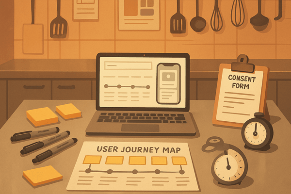
    The test and collect phase of the Design Sprint turned our concept into a reality and required all of us to go from the kitchen to the table by defining the ideal target audience and the ingredients to success, assemble and clearly brief the A-Team, and unpack the truth.


    From the Kitchen to the Table


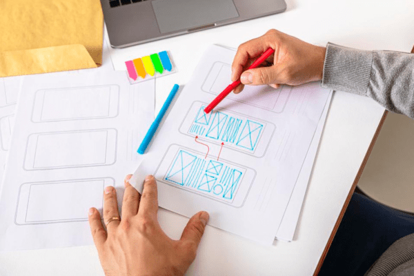
    The amount of preparation, attention to detail, and speed that is in the kitchen behind closed doors to create that incredible meal and deliver it to a table successfully is not easy. It is the same case when creating a prototype in a Design Sprint and getting it to external user testing. To do this, you need to start by defining your ideal target audience. To define our target audience for PennyPal, we separated the large gamut of our potential Gen Z  users into three buckets: high school students 16-18, college students 18-22, and “early career starters” 22-28. For each of these audiences, we took time to learn their key traits and needs. Doing this led to successfully recruiting five participants, and then, we did what any good restaurant does: we sourced our ingredients for success. We created clear logistics, location, and duration for user testing and shared that with all five of our participants. Doing this eliminated any potential confusion, so they were ready to have a great experience that would give us rich data.


    To get this great meal to the table, aka get the prototype to the participants and begin user testing, we needed to “serve success,” which is making sure our team has created and can facilitate scenarios that reveal insights to define an actionable path forward for the following priorities: PennyPal’s growth, PennyPal’s strategy, PennyPal’s Brand DNA.


    This process reminds me a lot of the first step in the five steps to finding your target audience. According to this article by Adobe, audience targeting starts with a close look at your business’s products or service offerings and there are three steps to get your answer.

    1. Determine what problem your goods or service solve.
    2. Think about who’s most likely to benefit from your product or service solution.
    3. Define your unique selling proposition.


    Image Source: Adobe


    Assembling and Briefing the A-Team


    To set up your participants for successful external user testing, you can’t just put the bat signal out and hope for the best. If we wanted our participants to be the best version of an A-Team they could be, we needed to establish a recruitment plan and brief them on what user testing is. Explaining to our participants the value of user testing and that it’s important because it reveals underlying issues with the app, improves the user experience, and builds empathy helped make this experience enriching for everyone. One of my teammates also did a great job of establishing a recruitment plan by creating a consent form, communicating with participants via succinct emails, and sending out a calendar link to book a time to participate in the user test.


    Sprint: How to Solve Big Problems and Test New Ideas in Just Five Days by Jake Knapp talks about a concept called “The Five-Act Interview.” This is a structured conversation between the facilitator on the Design Sprint team and user testing participants to get comfortable and establish some background. Act 4: Tasks and Nudges, asking the user to do realistic tasks during an interview is the best way to simulate real-world experience. The facilitators on my team for the Design Sprint really leaned into this concept during all five of our user tests to create this atmosphere.


    Reflecting on the value of user testing also helped me realize that it really is priceless in the end. Many companies try to skip corners and take shortcuts by de-prioritizing user testing due to time, budget, or resource constraints. But skipping it altogether would be a massive shortcoming. If you don’t want to take my word for it, a research blog written by a revered prototyping app company named Marvel put it perfectly. “It’s a great chance to get to know your users. Learn who they are, what they want and why they need this product. How do they need it to function? How will it fit in to their day to day lives?”


    Image Source: Marvel


    Unpacking the Truth


    After we completed the external user testing with all five participants and they all finished a post-test survey we provided, we were left with rich data to dive into. Post-test survey questions revealed to our team great insights such as:


    • Overall, the app does a good job of incorporating education along with all its other qualities.
    • PennyPal’s core features prioritized Gen Z’s key traits and needs, with features like Daily Trivia and Goal Setting.
    • There’s a resounding connectedness to education, but room for improvement on the entertainment side of things.


    These rich insights connect directly back to the Design Sprint questions and long-term goals we established at the beginning of the process. Questions like, “Do our gamification features drive repeated engagement? And long-term goals, such as enabling users to set and achieve personalized financial goals.


    Identifying patterns and themes to connect these insights to decisions we can make about PennyPal, reminds me a lot of the reflection process we do at my job after one of our annual campaigns. I work with a team of development professionals at Quinnipiac University’s Development and Advancement office. My role is specifically focused on digital engagement (social media, email marketing, event registration webpage building). A team of eight people including myself held a retrospective after one of our annual fundraising campaigns and I brought to the group a few slides identifying a pattern of looking at our emails year-over-year and seeing how we changed the send address to use personal names instead of a general email alias, and the emails using personal names performed significantly better. This occurrence was me identifying a pattern to connect an insight for our group to react to and make a decision.


    This final stage of the test and collect phase of the Design Sprint reinforces why you should conduct a sprint early in the lifespan of your business or product launch. I came across an article by Fast Company that expands on this idea and explains the reasoning further in a very comprehensible way.

    “The ROI of customer research is greatest when the risk and cost of building the wrong product are high. But even when it’s easy to build an MVP to launch and learn, sunk cost fallacy can undermine a team’s objectivity and willingness to scrap their work. Why risk making a bad first impression when it’s easy to find and fix problems before launch?”


    Getting stakeholders to understand the truth behind this statement could make or break your Design Sprint.

    Image Source: Fast Company


    I’m looking forward to packaging all the work my team and I did over the last seven weeks to present the impact of a Design Sprint in a professional, understandable, and actionable way.

  • Why it isn’t the Tools, it’s How We Use Them

    Image Source: Generated by Copilot


    The imaginative process of Storyboarding created progress for PennyPal. It enabled our team to think through “what if” possibilities for our app and set us up to transition to the next stage of the Design Sprint that will address our goals and define how we can meet the wants and needs of our users. This next stint of our Design Sprint explores how we leveraged these storyboards to create PennyPal’s blueprint, defines what conditions we carefully curated as we move into user testing, and gives our team more clarity on why change is the only constant.


    Creating the Blueprint


    It was time to move on to the most difficult phase so far: Prototyping and Refinement. We needed to divide and conquer tasks as a team and ultimately build a realistic and clickable version of PennyPal. The prototype will have several user flows to showcase how various features work, including account sign-up, goal tracking, daily trivia, and the chat room. Our two designers, Chloe and Andrea, chose the suite of software to use to build this prototype, selected fonts that capture the brand’s ethos, found simple iconography, and stuck with PennyPal’s color palette to make sure everything was on-brand.


    Being crystal clear about design decisions, what the product breakdown is for key features of a prototype, and delegating tasks for each person on your team reminds me of Gemma Lord’s (a Design Director at IDEO) reflections on how the changing nature of design has given designers a seat at the top table. One specific point Gemma makes that resonated with me during this phase of our Design Sprint is:


    “I wasn’t there to design a product. My role, instead, was to shape the conversation itself – to ensure these leaders understood the trade-offs they were making, to help them see the long-term implications of their choices, to make sure that, somewhere amid the graphs and growth projections, the people their business serves were not forgotten.”


    Image Source: Design Week


    I noticed that these exact same reflections and feelings were top of mind for my team and I during this phase of the Design Sprint.


    Carefully Curated Conditions


    After our designers completed the prototype, it was finally time to test PennyPal for the first time. PennyPal’s main goal is to improve Gen Z users’ personal finance literacy in a compelling way that makes them want to come back to the app because of its entertaining and educational features. Facilitating a user test simulation internally helped the team identify what to fix within the prototype, test our moderator script to make sure any user would understand the three scenarios we want them to go through, and ensure the testing results are actionable insights to move forward.


    For user testing, I was the internal user test subject because I didn’t participate in designing the PennyPal prototype. I tried my best to stick to the three scenarios and remember the “prototype mindset,” a concept introduced to me by the book Sprint: How to Solve Big Problems and Test New Ideas in Just Five Days.


    “Building a façade may be uncomfortable for you and your team. To prototype your solution, you’ll need a temporary change of philosophy: from perfect to just enough, from long-term quality to temporary simulation.”


    The prototype mindset is something I use at my job regularly as well. One of my responsibilities is analyzing digital engagement metrics for social media and email marketing to understand what is and isn’t working. I use these insights to make and implement recommendations on how to market more effectively. I created a report share-out using the prototype mindset that it didn’t need to be perfect, but built out just enough to share data insights with my extended team. Doing this helped my manager and me understand how we can create a long-term quality solution over time that will be useful for everyone.


    The prototyping phase of a Design Sprint and completing an internal user test reveals the importance of the role UX plays in building brand consistency. Don Norman, a pioneer in UX design, said it best in his book The Design of Everyday Things. “When you have to explain how something works, it is a failure of design.”


    Image Source: Forbes


    Change is the Only Constant


    After we completed internal user testing, it was time to take these insights and learnings from our trial run findings to external user testing. Our trial run findings created the opportunity to refine our three scenarios and informed our team on how to complete external user testing to validate the prototype, test our original hypothesis, and collect usable data. The process of internal user testing and the insights that surfaced afterwards reminded me that change is the only constant.


    The Design Sprint is structured so that all stakeholders who participate in it experience iterative learning. This makes the sprint agile and productive. You and a team of people can define a problem, establish an environment to sketch solutions to that problem, design a prototype to test these solutions, and connect with a user base to gather real-world data to decide if you have answers to that original problem and can move forward.


    This phase of the Design Sprint showed me how user interface design and human behavior are both multidimensional. Jakob Nielsen, an author and pioneer of UX, stated it perfectly in an article titled The Usability Scaling Law: Death of User Testing?: “The complexity is immense; think of all the variables: user goals, prior experience, cognitive load, cultural context, device characteristics, and the sheer variety of tasks and information domains.”


    Image Source: Jakob Nielsen on UX


    I’m looking forward to the rich data we’ll collect from our external user testing in the next day of the Design Sprint to answer some of our challenges and really see how usable PennyPal is.

  • New Haven Pickleball’s Brand Promise: More Than Just a Game

    Image Source: Photograph taken by Steve Walter

    At its core, all brands are a promise. Usually, the first thing that people picture when they hear the word “brand” is a logo, colors and some type of slogan. Gathering all these components together to tell people a story and effectively communicate whatever good or service you are selling is how you succeed in creating a successful brand that changes someone’s life. Taking this visual design course taught me to think about branding holistically from the perspective of a designer. Specifically, how every little decision whether it’s using a chunky serif font to evoke an assertive tone, choosing a balanced trio of colors, or creating a certain style of illustration on product packaging to target an audience; all these decisions add up to the total sum of what makes a brand memorable.  

    The culmination of these design skills I learned over the last seven weeks is on display in the new brand guidelines I designed for New Haven Pickleball. This is a community to connect with local, fellow pickle-ballers. No matter if you are brand new to this brilliant game or prepping for the day it is in the Olympics, you are welcome! I discovered this community in the summer of 2024 and almost one year later, have met many incredible people that I play Pickleball with regularly. Creating brand guidelines for New Haven Pickleball was a fun, yet challenging process since the brand had no foundation to work off besides a name and a few social media pages. I’m going to take you through an aspect of the brand guidelines that is one of the most vital components to making this brand what it is.

    Verbal Brand

    Regardless of the company or organization, the anatomy of all brands has a verbal brand component. For New Haven Pickleball, all it had was name. When you really think about it, a verbal brand is so much more than a name, it’s your company’s slogan, personality, tone of voice, and style of language.

    After reading a chapter on branding from the book “Graphic Design For Everyone” by Cath Caldwell, I understood what all of these parts of a verbal brand meant. After thinking, research, and some trial and error, I decided to change the name of this company to NHV PB, created the slogan “Community > Competition”, and established its values are inclusivity, positivity, learning and passion.

    These decisions about NHV PB’s verbal brand set the tone moving forward for the copy I used on marketing collateral including an event poster, brochure about the spring league, and a home page design comp for a website mockup.

    The slogan, “Community > Competition” might be the most important aspect of NHV PB’s verbal brand. This company is mainly a community. The “good” it sells is the sense of belongingness, camaraderie, and the opportunity to consistency play pickleball. Using this phrase as a slogan that appears on print collateral, merchandise, and digital properties echoes inclusivity as a brand value and welcomes players at all levels while still validating the legitimacy and opportunity to progress and get better at pickleball.

    I look forward to learning more about visual design and the opportunity to potentially work with the league manager who created New Haven Pickleball to implement some of these brand guidelines.


    Sources

    Caldwell, C., & Skene, R. (2019). Graphic design for everyone: Understand the building blocks so you can do it yourself. Dorling Kindersley Limited.

  • From Lens to Canvas: Crafting Emotional Connections in Design

    Image Source: Generated by Google Gemini

    Conveying information to elicit an emotional response is one of the most powerful skills a designer can master. From photos to hand-drawn illustrations and even digital artwork, each form of imagery is a core component of graphic design. Something that stood out to me in this learning module is the juxtaposition of Illustration and Photography. Specifically, what illustrators can convey vs. photographers, the factors in the decision process illustrators go through when choosing a style, and the intersection of goals illustrators and photographers share. Let’s dive in!


    Photography: Capturing the Moment

    Photography is your best friend if you are trying to visually depict a product, establish a mood, and ultimately build a relationship with your target audience. A few of the most practical outcomes that photography creates for graphic designers are the ability to sell a product, establish trust, tell a story, or teach a technique.

    For my semester-long brand project, I am working on creating a visual and verbal “Brand DNA” for New Haven Pickleball, a local pickleball community I am part of. Using photography that captures pictures of people serving, dinking (a light touch hit in pickleball), and drop shots can showcase the wide variety of shots in pickleball and teach members of this community proper form for these different types of shots.


    Illustration: Carefully Crafted

    Illustration is typically a form of art that depicts a product or location. One of the most valuable aspects of illustration is its ability to convey abstract concepts. Because of its versatility, illustration usually enables designers to reach their target audience in ways that photography typically can’t. A few of the best examples are creating reality with personality, showing how, revealing what lies beneath, imagining prehistory and fantasy, and visualizing a complex idea.

    Continuing with the example of the New Haven Pickleball organization that I am doing my “Brand DNA” project on, creating an illustration to showcase different types of paddles and the various materials that make up a pickleball paddle and how they impact the type of play style it favors, would be a great example of how an illustration would work best instead of a photo.


    The Decision Tree: Differences & Similarities

    If you’ve identified wanting to use or create an illustration for your brand/company, there are a few essential things to consider. The purpose of the illustration, its overall brand (mood, tone of voice, being reflective of the brand’s personality), understanding who your audience is, and the medium that your illustration is being designed for (where most of your audience is viewing it). I would likely choose a freehand digital style for any illustrations for New Haven Pickleball because it would enable me to use the brand colors freely which range the spectrum from bright to dark. This would also help me evoke the brand’s chatty and informative personality without being forced to use an illustration style that comes off as childish, luxurious, or serious, which wouldn’t appeal to most of my target audience.

    For photographers, the decision-making process looks a bit different. After a photographer decides what they’re shooting as a subject and are ready to go, they need to consider the following factors to get the best composition that’s appealing and impactful; fitting the format to the subject (deciding if horizontal or portrait format makes sense), using the rule of thirds, considering the background, and using lines to lead the eye. If I were shooting some pictures for New Haven Pickleball, I would use a portrait or vertical frame for photos of a pickleball paddle to capture its entire length. I would also capture some low-angle shots from the ground and use the court lines to lead the viewer’s eye to showcase some photos of people playing a game of pickleball in an interesting way.

    Anyone can take a photo or create an illustration, but getting the most out of either form of imagery is crucial to being a successful designer who knows how to tell a brand’s story and convey its emotion. I hope you learned a bit about the differences between photography and illustration and how both can elevate your brand and take it to the next level.


    Sources

    Caldwell, C., & Skene, R. (2019). Graphic design for everyone: Understand the building blocks so you can do it yourself. Dorling Kindersley Limited.

  • Evoking Emotions Through Writing: Why Typography is Branding’s Unsung Hero

    Image Source: Canva Dream Labs AI Generator

    Every day, the average person reads about a dozen different typefaces. Whether it’s a billboard for a new business that opened in your neighborhood, the recipe for a meal in a cookbook, or a television broadcast of your baseball team. Typography is one of the most powerful tools to convey emotion. Although it’s something most people seldomly think about in terms of understanding its core components and how to use it to convey specific moods, it is one of the most powerful tools a designer can have in their arsenal.

    After thinking about this week’s readings, videos, and assignments, I’m going to delve into the anatomy of type, explaining how several core components make up a typeface and ultimately the mood it conveys.

    Every Major Cog in the Machine

    After reading the first section of chapter 2: building blocks in the book, “Graphic Design for Everyone” it started to click for me. Just like the technology we have that uses lots of parts to make a device work, Typography has a nuanced anatomy with various components that make up its structure to create different typefaces. I’m going to teach you about three different components that make up the structure of a Typeface for you to better understand how designers can manipulate these things to create different typefaces.

    Ascenders

    The first component I want to examine is the ascender. An ascender is the part of the lowercase letter that extends above the x-height (the height of a font’s lowercase x). If a designer selects a font with high ascenders, it’s usually because they want a letter to be easily distinguishable. You’ll see this often with book titles, such as the example pictured below which would be used as a font for a fantasy book.

    Image Source: Creatype Studio

    Bowls

    The next component we’re going to look at is a bowl. This is the curved stroke that creates an enclosed space. This is a significant element of type design because the size, curvature, and proportions of the bowl can vary significantly depending on what typeface you’re using. A great juxtaposition to look at to better understand the bowl, is comparing the letters R and B and this article titled Typography design 101: a guide to rules and terms” explains it perfectly.

    “The letters B, P and R are sister shapes, one being derived from the other. However, that doesn’t mean they have the same proportions. The bowl of the R needs to be slightly thinner so that when we connect the leg to it, it won’t become super thick. While the upper bowl of the B needs to be smaller than the bottom one, so that the letter appears more stable.”

    Image Source: 99Designs

    Serifs

    One of the most prevalent components in all typefaces is the presence or absence of a serif, a small, decorative extension at the ends of some strokes. This component defines whether a typeface is a serif type, or sans serif type. Serif types have this decorative extension and sans serif types do not. When you compare the two next to each other you can immediately tell a different mood is set. Serif typefaces typically look authoritative, professional and serious. Sans serif typefaces are usually quirky, whimsical and fun. Choosing these your typeface wisely based on your brand’s essence and expression can make or break your brand in terms of how it resonates with your intended target audience.  


    Although typography is the unsung hero when it comes to what the average person thinks of when they hear the word branding, understanding it and mastering it is one of the most useful skills a designer can build.