The beauty of Motion Design and Animation? It’s a limitless medium that uses structures to turn visual elements into a cohesive story that creates an emotional impact. Defining a consistent theme and taking time with the storyboard process are two of the most foolproof ways to create a memorable animated story.
Animated Storytelling by Liz Blazer taught me how to plan out “beats,” moments, or active steps in your story that move the plot forward. Blazer also does an excellent job of breaking down the differences between linear and non-linear story structures and offers storytellers four different types of non-linear structures to use: Book Ending, The Countdown, The Puzzle, and The Beaded Necklace. Understanding all this helped me immensely with storyboarding for a personal animated introduction video I created.
After I was confident with my storyboard and curation of audio and visual files, I followed Blazer’s advice by creating an animatic, a video version of my storyboard laid out in sequence on a timeline in After Effects with a soundtrack aligned to the video.
Learning about specific aspects of storytelling and storyboarding enabled me to transform an idea into an executed animated video with a clear beginning, middle, and ending.
Research
IKEA, Together
This video captures the limitless possibilities of customization and the beauty of “DIY,” something IKEA became globally recognized for. The transitions from room to room with bright colors are inclusive, and the upbeat pop song spliced together with tasteful, high-pitched sounds of fingers snapping to signal transitions is catchy. This motion graphics video makes the viewer want to visit the closest IKEA store to get lost in possibilities and dream up the next room to create in their home.
Introducing Google Vids:
This piece by Google is energetic, imaginative, and creates a perception for viewers that they can create anything. Between its pretty liquid glass search bars, cozy keyboarding typing noises, and captivating floating icons, you watch this video, enamored by the “shiny” possibilities of AI technology.
Porsche Holiday | The Coded Love Letter
We are in the middle of the next digital renaissance with the advent of AI. As a result of this new era, imagery and videos are all starting to look eerily similar, and there’s a resistance to this technology. The iconic car manufacturer, Porsche, went against the grain by creating this hand-drawn animated commercial for the 2025 holidays called “The Coded Love Letter.” Its focus on Porsche’s design and history with hidden easter eggs, including the first license plate number of a Porsche, the tractor created by the founder, and the iconic race car, the pink pig, captured the brand’s human spirit.
Create
Meet Kyle Adams! Personal Intro Animation Video
For this project, I created an animated introduction using the programs Audacity and After Effects! I started with storyboarding to create a clear structure of what this video would dive into. I knew I needed several scenes to introduce myself, briefly explain what I do for work, showcase a hobby or two, and highlight what I am striving to learn.
After I created six storyboards and decided what type of media each scene would have (pictures, videos, or b-roll photography/footage), I moved on to Audacity. I wrote my script in a Word document, practiced two takes, and then nailed a final take where I said exactly what I wanted to. I edited the wave audio file slightly in Audacity to bump up the gain of the volume levels to land in a range of -12 through -6 to get as close as possible to maxing my narration out without distorting it.
After I curated all of my audio files (narration and music), images, and videos, I brought them into After Effects to create the animated intro! For the first scene introducing me, because I was using two photos from a vacation I took to Portugal, I wanted my introduction text to animate in a way that complemented a cinematic and travel-documentary vibe. I landed on using a Playfair Display font that evokes an elegant, modern, editorial energy, and created a directional mask reveal to animate the text.
Adding transitions to fade in and out for various audio tracks and the song I chose for this video, as well as keyframing different scenes to tie the whole video together, was quite challenging, but very rewarding! I’m excited to continue learning about Motion Design.
The idea of sitting in silence scares most people. Until sound or music is taken away from a piece of art of setting, you don’t realize how big its impact really is. Sound is a medium that transforms ideas into immersive worlds. It elevates concepts into unforgettable stories. Animators and filmmakers can take the sound of heavy footsteps paired with a high-pitched violin to create the sense of fear or use laughter and a soft whispering voice to create the feeling of comfort. The addition of intentional sound effects and music in animation is what separates masterful from mediocre projects.
Animated Storytelling by Liz Blazer puts into perspective how important sound is to animation. “The notion of sound is that it’s reactive, almost obedient, to action. All sounds are the result of objects vibrating. Sound alone can propel a story forward.” Blazer goes on to define the difference between diegetic and non-diegetic sounds. Diegetic comes from sources visible on the screen that come from the physical world. In my stop motion animation project, I added sounds of coffee grinding, coffee pouring into a cup, and a skateboard pushing away. All these sounds matched the visuals viewers were seeing on screen and added to the immersion of my story. Non-Diegetic sounds come from sources that are neither visible on screen nor have been implied to be present in the action. This includes sound effects that are not natural to objects in the scene. I added a lo-fi jazz soundtrack to my stop motion animation because this non-diegetic sound enhanced the cozy mood a café wants to emulate.
The collection of examples below showcases how powerful and effective audio and text animation are when it comes to creating masterful projects, and as Liz Blazer says, designing “wonderland.”
Research
Spirited Away (Audio)
This film by legendary director Hayao Miyazaki is one of my favorites for its world-building, immersion, and reflection on some of life’s biggest questions and conflicts. Spirited Away really leans on atmospheric soundscapes like windy weather, distant chatter in a busy marketplace, eerie footsteps, and lots of other diegetic sounds to make viewers feel certain emotions at specific points in the movie. The music does an excellent job of progressing the story and seamlessly shifts from tender, heated exchanges to surreal, peaceful moments. Lastly, it’s quite impressive that Miyazaki and his sound engineer traveled to hot springs in the real world to record authentic bathhouse noises for sound effects, including water movement, steam, and bubbles. See below for a great analysis of how sound enhances storytelling!
Severance (Audio)
One of my favorite television series, Severance, a dystopian sci-fi thriller about workers who undergo a procedure to separate their work life from their personal life, is a masterclass in using sound. Through both seasons of the show, ambient sound was used to build an unsettling corporate world with long, windy echoing hallways, low mechanical ambience humming in the background, and keyboard clicks as Lumon workers completed their tasks in macrodata refinement. A core concept of the show that was driven by sound was the characters shifting from their “innie” to “outtie” every time they went up and down the elevator leading to their workplace at Lumon. As a worker goes down the elevator, a g note on the keyboard plays to indicate the shift has started, then a lower tone plays once the transition is complete. This convention is used throughout the show and is used to drive the plot (don’t watch the video linked below if you don’t want any spoilers).
Napoleon Dynamite (Text Animation)
One of the most iconic indie comedy movies that is considered a cult-classic is Napoleon Dynamite, the story of a goofy, awkward teenager living in rural Idaho. Often overlooked, the title sequence of this movie sets the tone and is quite unique, turning everyday objects into animated typography. The title sequence uses a myriad of simple meals arranged on colored plates using sauces to spell out phrases. For example, a burrito and rice sit on a plate with mustard spelling out “and Paramount Pictures Present.” These hand-crafted title cards, created from items that are essential to the film’s setting, immediately establish a quirky tone and offbeat personality, which is central to this film. See it for yourself through the video below!
Catch Me If You Can (Text Animation)
A top-tier example of effective text animation is the title sequence from Steven Spielberg’s movie, Catch Me If You Can. The silhouette animation, combined with smooth motion that’s also paired with text that moves in a playful, narrative-driven way, is why this is impeccable. The theme of deception and pursuit is quietly introduced here through visual rhythm. I highly recommend watching the video below to see what I mean! As well as the movie, if you haven’t seen it.
Create
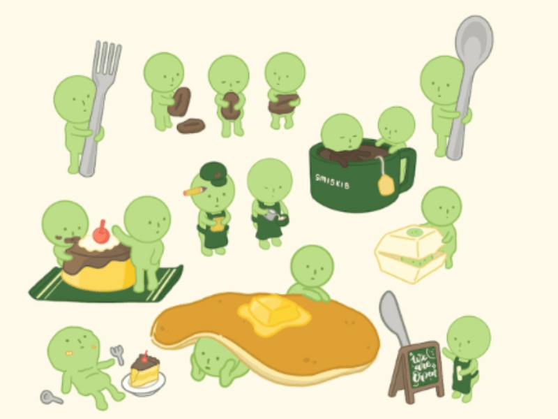
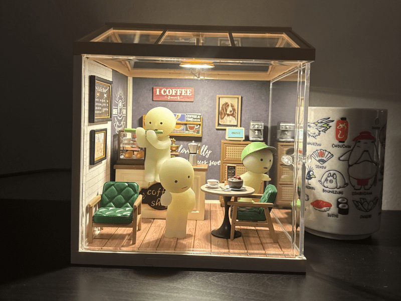
Smiski Café: Grand Opening Stop Motion Animation Video
Week four was a continuation of the foundational pre-production work done last week. It was time to create a stop motion animation video! I decided to choose my linear idea, “A Day in the Life at the Smiski Café.” I rented a tripod and lighting from Quinnipiac, set up my scene, changed my phone settings to shoot in the correct format, and created an audio command via Siri to take pictures hands-free.
This was challenging! Because I knew my project would be 12 frames per second, I needed to take a minimum of 12 pictures for every one second of video. That’s at least 360 pictures in total. After I reviewed my storyboard from last week and realized what items in my café were and were not movable, I had to pivot a couple of my scenes. Instead of “A Day in the Life at the Smiski Café,” I pivoted to make this story the “Smiski Café: Grand Opening.”
The original scene was going to be more about a single incident, coffee and food falling, and then a barista getting the customer new food. I realized my food and coffee cup that was part of the café set, were glued onto the table. There also wasn’t enough space to make this work and take enough varied pictures. I pivoted the story to the customer getting their order successfully, enjoying some live music, and leaving the café happy.
Despite the challenges, this was an enjoyable project! If I had more time, I would’ve loved to think of a longer story and potentially reshoot the pictures to fit the 16:9 aspect ratio perfectly.
Planning with precision is what separates master storytelling from mediocre storytelling. Although storyboards may seem taxing and could be seen as a waste of time, this foundational work sets the stage for success. Color and experimentation are two core aspects of motion animated storytelling used in motion design to create incredible stop-motion animations.
Animated Storytelling by Liz Blazerexplains how color palettes are used to create specific moods, emotions, depict motivations, and progress scenes in a certain way. One specific process Blazer explains is creating a color script. This involves firmly deciding what color will be dominant in your animation, then creating storyboards to define how the color will be used and connect to the overall theme.
After you’ve mapped out your color choices, another suggestion to be mindful of is embracing experimentation. Animation can be thought of as a science experiment because of its approach. Just like science, this process involves tons of trial and error, and as a creator, you are encouraged to experiment, make new discoveries, potentially fail, and try all over again.
The curation and analysis of stop motion animations below examines why each of these are so memorable and how the creators use color or embrace experimentation to create something incredibly unique.
Research
Kidsuper: Everything is Fake Until it’s Real
One of my favorite luxury brands created an innovative idea for a fashion show that was born out of limited opportunities because of the pandemic. Kidsuper is known for being expressive, playful, and very whimsical. When Paris Fashion Week pivoted to being held virtually instead of in-person in 2020 because of the pandemic, the brand went back to their roots in Claymation and stop motion by creating their fashion show with Barbie dolls. Kidsuper embraces Blazer’s important tip on designing for movement by ensuring the still Barbie dolls lined up on both sides to create a fashion show audience doesn’t detract from the runway where various models walk down frame by frame to emulate a traditional fashion show.
This short animation is incredibly impressive. It follows a narrative structure step by step of how to cook a cheeseburger creatively using LEGO pieces. The creator makes this animation so memorable and captivating by enhancing the story with a very intentional color palette. There are varying saturations and values of specific ingredient colors when assembling the burger. For example, in the animation, there’s a scene cutting iceberg lettuces that turns into individual LEGO pieces, and some of them are dark green, others are a light green, and a handful are white. This is very realistic to the true color of lettuce, which has different saturations and color values.
Netflix: Pokémon Concierge | Making Of | Netflix
This stop motion animation series was released in 2023 and brought a fresh take to an iconic global franchise. The ability to immerse fans in a new world with characters and Pokémon (pocket monster creatures) breathed new life into many that everyone knows and loves. In the video embedded below, the creators of the series explain the importance of experimentation and studying movement. They delve into Psyduck, a specific Pokémon that’s known for being dopey. Because its body is very simple, with short legs and arms that barely reach its belly, its range of movements is very limited. When Psyduck walked or ran in the animated series, they wanted it to still look dopey, so they intentionally added extra pointless movements to capture that emotion.
This one and a half minute long commercial brings a beloved potato chip brand, Pringles, to life in a dynamic, entertaining way. Simple movements with the pringles can rolling and moving on the ground in various ways, combined with upbeat music hooks a viewer and makes them feel energized, happy, and hungry all at the same time. Limiting the color palette to reflect the six flavors of Pringles being advertised created clear recall and made each scene of this animation unique.
Pes: Game Over
This conceptual animation transforms everyday objects into surreal animations. Pes uses common items like candles and muffins to emulate playing the retro video game Millipede. Through trial and error, there’s a natural blend of creativity with a scientific approach to create this clever, detailed miniature world that recreates the “Game Over” sequence in several retro video games millions of people know and love. This stop motion animation exemplifies the importance of embracing chaos to create magical moments in a story.
This week’s focus was pre-production. Specifically, creating two storyboard ideas for a stop motion animation that’s anywhere from thirty seconds to three minutes long. My first idea is: A Day in the Life at the Smiski Café. Smiskis are small figurines usually found hiding in the background of environments, or in the corners of small spaces. There are lots of different smiskis either colored green or blue, and come in various poses in “blind boxes.” This led to the collectible becoming viral and trendy as a room decoration. I chose this as my first linear story idea because I have several different smiskis and a mini café for them, and I knew I could come up with a clear story that has a beginning, middle, and end. The challenge I’m going to run into is moving these props just slightly enough to create fluid stop motion. There are also no aspects of the smiski that can move; each one is fixed in its own pose. I’m leaning towards this idea and still think it could work with maybe some added narration
The second story idea that’s non-linear is a brief stop motion animation about the tabletop deck-building game, Wingspan. This format follows the book-ending structure, where the story ends exactly where I began. In this case, that will be starting with the game fully set up and ending with the game fully set up. The challenge for this idea is going to be to vary each frame enough. I’m not sure if setting up the game is enough of a story to tell with stop motion. I’m really leaning towards the first day, unless someone can convince me otherwise!
Stop Motion Animation Test Video
Creating a stop motion animation was more challenging than I expected. Moving pieces in varying degrees to create fluid movement was tough. I also realized afterward that the camera and tripod aren’t fully level, as the cafe is slightly crooked.
When I capture all the still images for the full thirty-second animation, I’ll ensure the framing is straight on, have some lights to create consistent lighting, and plan to add a title sequence and some dialogue boxes to fully tell this story.
As exciting as it may be to jump headfirst into animated storytelling, it’s important to slow down and create a plan. The most beautiful, popular, and impactful animations from studios like Pixar and directors like Tim Burton completed preproduction to create masterpieces we all know and love, like The Nightmare Before Christmas.
Although animation and motion are different disciplines of art, they have a lot in common. Animation is typically referenced with filmmaking and uses character-driven stories. Motion is considered part of graphic design, with a focus on its impact on advertising, broadcasting, etc.
Animated Storytelling by Liz Blazer offers an insightful step-by-step breakdown of what needs to be done in the preproduction stage before moving on to animating. Liz delves into detail, explaining how to complete concept development, previsualization, and asset building. This first chapter of Animated Storytelling does a great job at defining all three of these concepts and further breaking down the questions you need to answer in each step.
For example, in concept development, you define what the piece of work you’re creating is about and what it will answer. Blazer outlines specific questions you can write out on a whiteboard or stick notes, some of which are: What must it be? Who is it for? How long must it be? What is the objective of the piece? When is it due?
The biggest takeaway from the introduction and first chapter of Animated Storytelling is “Slow is smooth. Smooth is fast,” and you can’t achieve this without preproduction.
GIFS Curation
1) This first GIF stood out to me because of the juxtaposition between the simplicity of the drawing and the endless loop motion. Twirling a pencil is a common frame of reference that everyone has used when they’re deep in thought. It takes me back to when I was writing essays in a classroom!
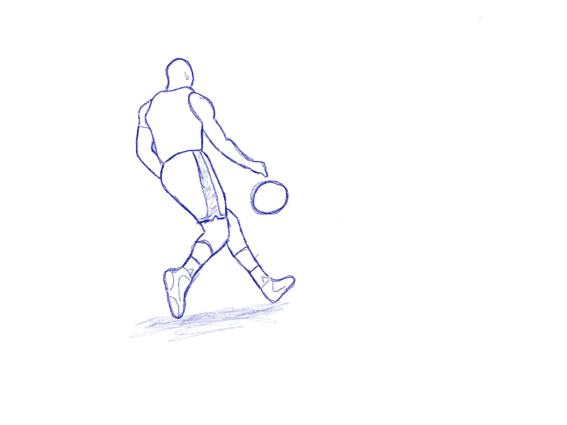
2) Moving individual drawings to create a sequence using a flipbook is quite challenging. This dunking GIF is impressive and captures the satisfaction and triumph of taking flight to dunk a basketball.
3) This is a solid example of a stop motion animated GIF. Using a cut-out of a picture and taking lots of pictures where each one moves slightly to create a dance with keyframing makes you feel the celebratory emotion from this GIF.
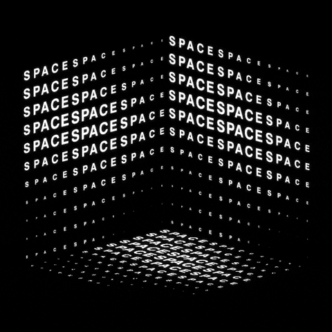
4) The paradox of this GIF is captivating because the word “space” creates a cube that almost acts as a prison with no space. This is also a great example of tweening!
5) The next GIF of garlic crying is memorable and relatable when you cut an onion and your eyes start to water. This GIF is also a great example of the onion-skinning technique that’s created by a frame-by-frame hand-drawn animation.
For this GIF, I focused on creating a “cut-out” style that has a disappearing and reappearing element. I found the image of the neon red digital clock displayed outside in the dusk with a person pointing at the time. It was challenging to create several separate layers to isolate each digit in the time display and then properly sequence them on the video timeline, where the different digits displayed were blocked at various times to create the flickering effect.
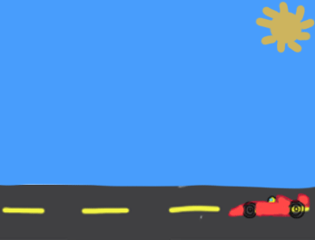
Don’t Blink or you’ll Miss it
This second GIF is inspired by my passion for Formula 1 Racing! I drew a simple car driving down a road during the day and used the onion-skinning technique to animate an aspect of the drawing over time. I chose the sun since it was a simple enough drawing to draw over and over again and adjust the spot slightly. I’m interested to see how keyframes and other features within this technique can adjust other aspects of a GIF over time to make it more engaging.
Rising Steam into Stars
The last GIF I created was the most challenging, a Cinemagraph. It took me a while to find an image with a singular cohesive movement that was repeatable, so I could isolate that one area with a layer mask to peek through and see the video behind the still image. Creating this GIF solidified for me how powerful layer masks are, how to add videos with still images, and what additional properties, including brightness or feathering, can do to enhance a GIF.
Storytelling is the most crucial component of visual design, captivating any audience. Leveraging the hero’s journey as a blueprint for visual design and storytelling is a tried-and-true method that we’ve seen succeed in cinema, novels, and advertising. Using the hero’s journey, you can win the hearts, minds, and wallets of anyone. Before diving into granular details like unpacking the psychology of narratives, explaining the applications in visual storytelling, covering use cases in UX and design thinking, examining a few brand case studies, and considering the future outlook of the role of the hero’s journey, let’s start with defining what this framework actually is.
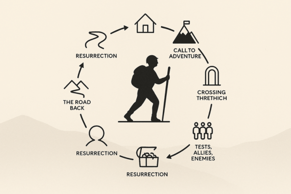
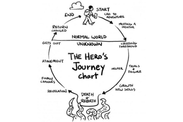
The Hero’s Journey Framework can be traced back to “The Hero with a Thousand Faces,” a book published in 1949 by Joseph Campbell. This is a universal story structure found in myths across cultures spanning generations. The journey typically involves three stages:
1). Separation: The hero leaves their known world, called for adventure. 2). Initiation: The hero faces a series of challenges. Meeting allies, mentors, and enemies along the way. 3). Return: The hero comes back to their known world with a tangible treasure, new knowledge, or something to benefit their world.
How to Use the Hero’s Journey as a Design-Thinking + Foresight Tool articulates the power of the hero’s journey perfectly. “This circular pattern has proven time after time to fulfil a promise of a new and exciting world that challenges us and changes us at our core. It’s the type of adventure everyone dreams about.” (Zaidi – Module 2)
There’s a reason why the hero’s journey is one of the most popular storytelling formats, that is so prolific and exactly why we’ve seen it leveraged as a blueprint for visual design. Disney, one of the most valuable IPs globally, worth about $200 billion, has built a framework using the hero’s journey, which they’ve used for hundreds of films. It looks like this: “Once upon a time… And every day… Until one day… And because of that… And because of that… And because of that… Until finally… And since that day… The moral of the story is… (Shopify).
Now that we understand what the hero’s journey framework is and how it creates success, let’s examine the psychology of narratives to understand why humans respond to story arcs.
Crafting narratives engages audiences through storytelling, emphasizing emotional engagement, cognitive biases, and reasoning, making people respond to story arcs far more than to raw data. The hero’s journey applies here because businesses frame their target audience as the “hero” and position themselves, the communicator, as the “mentor.” This is one of the best ways to bridge the gap between narrative psychology and design thinking. Crafting Compelling Narratives: Factors for Effective Message Delivery in Accounting published in the CPA Journal, proves this by unraveling the psychological impact of using a narrative structure that leverages the hero’s journey in the world of accounting.
“The accountant’s role as a mentor is to guide the audience through accepting this initial finding and leading them on the journey of discoveries. By the time rising insight #1 is presented, the audience (“hero”) is navigating unfamiliar territory, encountering allies and adversaries (e.g., those who supported and opposed the equipment upgrade).”
Stories go beyond entertainment. Stories are the backbone that builds emotional engagement and improves memory retention through the narrative structure and neural mechanisms. Reading fiction activates neural networks and emotion-processing regions of the brain, unlike other forms of visual design. The Science of Storytelling: How Fiction Shapes the Mind, an article by Psychology Today, explains this in the following way:
“For example, the brain’s mirror neuron system, which plays a key role in empathy, responds to characters’ experiences as if they were our own. This suggests that fiction is not merely make-believe—it is a kind of cognitive simulation that allows us to practice social and emotional skills in a low-risk environment.” (Psychology Today)
Designers, product managers, and marketers who understand the psychological impacts of the narrative arc are the ones who lead companies and brands that create products and services that leverage the hero’s journey to take storytelling a step further. Beyond understanding the psychological impacts, there are specific strategies people in these roles implement. Strategies within visual design that lean into metaphors and campaigns to personify brands.
Applications in Visual Storytelling (Advertising & Branding)
First impressions are everything. Before anyone speaks or reads something, we start forming an opinion based on what we see. Initial impressions play a big role in how we experience the world. So much so to the point that humans process visuals 60,000 times faster than text and 93% of communication is nonverbal. (ResearchGate – Module 6). The digital-first world and evolution of technology are dramatically shaping how people want to engage with all of this. Before we look at a few specific brands and how they apply visual storytelling to build narratives and tie back to the hero’s journey, it’s important to understand the four core principles of visual storytelling. (amplifi – Module 1)
1). Authenticity: Keep it real. 2). Sensory: Hit the feels 3). Relevancy: Bring it close to home. 4). Archetypes: Casting your characters.
All of this is to say that visual storytelling isn’t simply pretty pictures and text display. Visual storytelling is crafting a compelling narrative that connects with a core target audience emotionally and culturally. Best-in-class brands globally understand this and rely on emotional engagement to drive consumer decisions and build brand loyalty. For example, the beauty brand Dove celebrated its 60th anniversary by launching a campaign called #RaisetheBeautyBar, asking women to pledge to redefine beauty for themselves and young girls to challenge preconceived notions about attractiveness. (Time Magazine). This campaign, contrasted with typical beauty ads that rely on idealistic standards, exemplifies Dove’s commitment to authenticity and positioned the brand to succeed.
Another visual storytelling principle Dove used in this campaign is archetypes. As we know with the hero’s journey, consumers relate to characters they can see themselves as. The most memorable stories are the ones with characters the audience can identify with. For Dove, that was positioning itself as a caregiver archetype, empowering women, and being a proponent of self-esteem.
Brands that craft campaigns to position the four principles of visual storytelling at the forefront and understand how to build a narrative that ties back to the hero’s journey with archetypes, authenticity, relevancy, and by hitting you in your feelings, are what create a best-in-class brand that’s memorable and prolific globally. In addition to advertising, these brands also apply visual storytelling to their user experience and design thinking. Let’s see how.
The smoothest user experiences in design know how to bridge the gap between how people perceive and how designers communicate with intent to their target audience. Perception can be explained by Gestalt theory, the idea that the entirety of something is more important to our understanding than individual parts. Our mind interprets visual elements in principles including similarity, continuation, proximity, figure-ground, etc. (Thoughtbot – Module 4).
These Gestalt principles aren’t just to make interfaces prettier; they actually intentionally organize attention, influence user action, and give meaning to design in interactive systems. Examining evidence from minimal UI games, including Journey and Inside, supports this claim. Getting granular, you can choose specific Gestalt principles to better understand this.
“Moving on to Inside’s gameplay, the principle of similarity can be found in environmental elements such as crates, levers, or carts. They have a similar texture, shape, and contrast, and are often distinguished from the background by subtle lighting or edging. The player quickly recognizes that elements with this appearance can be moved or used to solve puzzles.” (ejournals)
Infusing storytelling in UX with brief human-centered narratives creates an opportunity to present designs in context. Following this method of screen-by-screen walkthroughs makes it easier to get stakeholder buy-in. Research company NN/g explains how to craft a UX story:
1). Establish a character & goal (who, what they’re trying to do) 2). Context & constraints (environment, time pressure) 3). Conflict (pain points) 4). Design intervention (how the interface supports resolution) 5). Outcomes & metrics (desired behavior, success signals)
This six-step bulleted checklist enables designers to create a storyboard of an end-to-end task that demonstrates the UX decisions made and every Gestalt cue in each storyboard frame (NN/g).
After drafting these initial UX stories, there’s an opportunity to operationalize all of this with design thinking sprints. Following the iterative process of design thinking, designers can define and ideate to translate pain points into patterns that follow Gestalt principles, prototype mockups focused on proximity, similarity, etc., can complete validation by running task-based tests, and communicate any findings as a UX story that’s rooted in measurable outcomes.
There are table stakes benefits for why you should use narrative frameworks. A few that come to the top of mind are the positive emotional engagement, seen when using the hero’s journey and visual storytelling, which improves memory and persuasion too; narrative frameworks create clarity and structure, which provides a clear arc for campaigns, and have interdisciplinary functionality, as seen in UX, advertising, and other areas of a brand.
Joseph Campbell’s hero’s journey is a prolific framework, but whether it’s universal for everything is up for debate. Looking at theme parks as an example, there are noticeable aspects that borrow stages of the hero’s journey but outgrow the 12-step arc. Star Wars: Galactic Starcruiser is a tangible example where guests create their own fragmented personalized stories instead.
Immersive protagonists – exploring the notion of the ‘hero’ in theme parks, an article published by Gröppel-Wegener, Alke, introduces a strong counterpoint to the assumption that the hero’s journey always applies. A woman named Margaret Kerrison, who has worked as a story lead on immersive projects around the world, proves that modern immersive storytelling prioritizes agency over passive observation. Kerrison offers an idea she calls emotional anchors instead of Campbell’s hero’s journey.
“These emotional anchors or ‘plot points’ keep the story moving forward in an emotionally engaging way. They keep the audience’s interest to discover and explore further. Like a movie or TV script, it propels the story forward, but unlike a movie or TV script, the protagonist is your audience. Your audience will choose what they want to experience next, so building these emotional anchors is vital to your experience.”
This is an interesting take to support the idea that the hero’s journey is a great starting point, but it isn’t a one-size-fits all solution for UX, branding, or immersive design.
Something we can’t lose sight of is the balance of narrative manipulation contrasted with authentic engagement. Ethical narratives need to balance emotion with honesty to build trust among target audiences. A first step to do this is to avoid imposing the hero role on audiences without consent. Narrative Spin, a content marketing consultancy, wrote a great article detailing the pitfalls of ethical marketing.
“The problem isn’t emotionally powerful stories but truthiness. When you write: a polished testimonial that skips the struggle, a founder origin story scrubbed too clean, a rags-to-riches narrative propped up by fantasy, not fact. These examples are about curating belief in a way that controls instead of resonates. In other words, these examples are not about connecting.” (Narrative Spin).
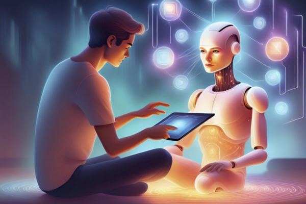
Narrative Frameworks in AR/VR and AI-Driven Design
Visual storytelling is headed in a direction that goes beyond a one-dimensional campaign and static UX flows. Technology is creating capabilities with AR/VR and AI to introduce dynamic and adaptive narratives that are evolving traditional frameworks like the hero’s journey. AI specifically is creating personalized storytelling with content that changes based on user behaviors, the context of the environment, and predetermined preferences.
A study evaluating a visual narrated storytelling concept to improve users’ understanding of explanations from an AI assistant unravels how to make this type of decision-making more transparent. It focuses on how trust and understanding depend on how explanations are framed and delivered.
“In operational settings, explanations should be available only when the user actively seeks clarification about the AI system’s output. Findings from the study show that fixed-timing delivery, while useful for experimental control, may disrupt workflows and cognitive flow in real-world operations. Participants expressed a clear preference for being able to access explanations when needed, rather than having them appear automatically.”
This directly supports the idea that depth needs to adapt to user expertise, task urgency, and cognitive state. Personalization, especially with AI, isn’t just about the substance of the content. It’s about timing, modality, and the control people have as users. Personalization needs to clarify AI and amplify its capabilities if we are to harness it in a way that advances visual storytelling to resonate with people and use the hero’s journey framework in ways we never have before.
Humans crave narrative and visual storytelling that leverages the hero’s journey as a framework to improve engagement, comprehension, and trust for brands. The hero’s journey is just one framework that provides structure for UX flows, branding, and immersive experiences to position people as the hero themselves so they can take the relatability of storytelling to the next level.
In an era of AI personalization, and technology like AR/VR that can feel cold and emotionless, it’s more critical now than ever for designers, product managers, and marketers to guide people in a way that gives them agency and prioritizes emotional connection. Visual storytelling done right is a competitive advantage. Prioritizing it is a non-negotiable for brands if they want to cut through the noise in our world of fragmented attention.
The most challenging thing right now that’s currently stopping brands is emerging technology. Now more than ever, it’s necessary to use narrative mapping in UX sprints, apply archetypes and emotional anchors in branding, combine gestalt principles with story arcs for intuitive navigation, and explore adaptive storytelling using AI-driven personalization and new technology.
The future of visual storytelling will belong to the designers who understand how to create experiences that feel like stories worth living. Integrating narrative frameworks is no longer optional; it’s the next phase of human-centered design. Design as we know it is changing, but at its core, it will always be what separates mediocre brands from best-in-class companies.
Brands that lean into this technology and leverage the hero’s journey in their visual storytelling will win the hearts, minds, and wallets of their target audience. The future for brands is limitless if they keep a pulse on what’s coming next and what will never go out of style.
Zaidi, Leah. How to Use the Hero’s Journey as a Design-Thinking + Foresight Tool | by Leah Zaidi | NYC Design | Medium, 4 Sept. 2018, medium.com/nyc-design/how-to-use-the-heros-journey-as-a-design-thinking-tool-c4901be5ce.
Montalto, Mike. “The Four Principles of Visual Storytelling.” Amplifi, 25 Jan. 2024, amplifinp.com/blog/4-principles-visual-storytelling/.
Bonner , Carolann. “Using Gestalt Principles for Natural Interactions.” Thoughtbot, 23 Mar. 2019, thoughtbot.com/blog/gestalt-principles.
Sidgman, Juergen, and Nathan V. Stuart. “Crafting Compelling Narratives.” CPA Journal, vol. 95, no. 7/8, July 2025, pp. 54–61. EBSCOhost, research.ebsco.com/linkprocessor/plink?id=5c24806e-8c3e-33f0-b54e-b20699915eb9.
Godek, Aleksandra. “Applying gestalt principles to User Experience Design in computer games.” Zarządzanie Mediami, vol. 13, no. 3, 20 July 2025, p. 183, https://doi.org/10.4467/23540214zm.25.017.22235.
Gröppel-Wegener, Alke. “Immersive protagonists – exploring the notion of the ‘hero’ in theme parks.” Media Practice and Education, vol. 25, no. 2, 2 Mar. 2024, pp. 137–148, https://doi.org/10.1080/25741136.2024.2324089.
Basjuka, Jekaterina, et al. “The Design and Evaluation of a Visual Narrated Storytelling Concept to Improve End Users Understanding of Explanations from a Conceptual Ai Assistant.” Behaviour & Information Technology, Dec. 2025. EBSCOhost, https://doi.org/10.1080/0144929X.2025.2596891.
Amid the business of everyday life, when attention feels scattered, there are still moments when time slows down, and you start to see specific patterns. Between the errands you have to run and your daily rituals that act as an escape, the noise eventually becomes a quiet pause, giving you space to be present and wonder.
Abrupt Endings
Caption: A game finished before it could even start. You can feel the pulse of the city in each step you take on the sidewalk.
Repetition Finds Rhythm
Caption: Walking alongside a corridor of expression. Color fills this path and there’s a rhythm everyone follows on this walk.
It’s The Real Thing
Caption: This is a mural that remembers. It’s seen people across eras and all weather you can think of. But despite the passing days, this is where stories started.
A Crafted Pause
Caption: The aroma of caramel and chocolate overpower you with the first warm sip and you are able to return to a single breath in this moment.
Rituals are Priceless
Caption: A set of instructions on how to experience joy one bite at a time.
Precision Meets Perfection
Caption: Readiness is traced in stripes and movement is waiting.
Finding Calm in The Perfect Escape
Caption: A moment away from sirens, car horns, and laughter. All you can hear is the crunching of the ground.
Savoring Every Bite
Caption: A sweet sugary delight. With every bite you take a breath of fresh air.
Just Keep Swimming
Caption: Light is radiating from the ceiling above as patterns emerge above you following their own path.
A Quiet Flame
Caption:The journey ends not in silence, but through signals that offers a different type of serenity.
The goal of this photo essay is to illustrate how everyday rituals and the environments that surround us may appear to be full of disorder, but the reality is there’s an aspect of calm in all of them. Starting with 100 photos, narrowed down to just 10, the photos you see were chosen because of their strong focal points, contrasting environments, and smooth overarching narrative coherence that’s rooted in visual diversity.
The sequencing of the photos is designed to tell a narrative arc that starts with urban chaos, moves to daily rituals, transitions to play in dynamic places, and ends at home calmly.
Between Chaos and Calm: The Intersection of Stillness, curates a selection of photos that demonstrate visual storytelling concepts like storyboarding, utilizes Don Norman’s Emotional Design Framework in several images, and taps into gestalt principles.
From Street Marks to Pictorial Storytelling
Storytelling is used in design to help customers emotionally connect with a product or service through a narrative. Five Steps To Design Your Product with Powerful Storytelling by Chiara Aliotta outlines the importance of the hero and their journey, identifies what the problem is, and showcases the transformation that design solves. The photo essay and its 10 images mirror this structure. The “hero” who is the viewer in this case is experiencing bits and pieces of urban life and rituals. The “problem” is the chaos and overstimulation that’s overwhelming in day-to-day environments. Lastly, the “transformation” is the transition to calm spaces and rituals, including visiting a coffee shop and ending the day at home.
This photo essay also taps into the four principles of visual storytelling, specifically the sensory pillar to hit viewers in their feelings. Images like the third image of the Coca-Cola mural art on an almost century-old building is shot in a way to stop users in their scroll and make them taste and smell a crisp Coca-Cola.
Patterns in Action
Don Norman’s Emotion Design framework, as described by Ellen Lupton in Design is Storytelling, offers a lens for analyzing these photos. The fourth image of the East Pole Coffee cup is a perfect example because it evokes all three emotional responses. On the visceral level, there’s a sensory appeal from the bold red cup with an elegant font. On a behavioral level, the cup captures the familiar experience of pausing and sipping a warm coffee. On a reflective level, it can evoke personal connections with coffee culture and community to viewers who might have a similar lifestyle.
Another pattern in these pictures is the presence of the Gestalt Principles, specifically continuation, similarity, and Figure-Ground. Looking at continuation as an example, both the second image of the tunnel with graffiti and the sixth image of the pickleball paddle and sneakers in the parking lot use continuation with a tunnel perspective and parking lot stripe to guide the viewer’s eyes.
The Role of Visual Perception + Color Psychology
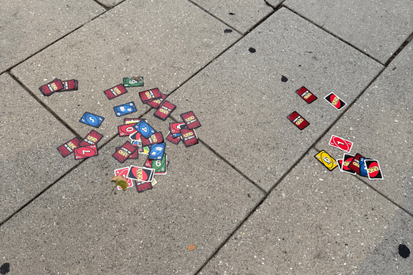
Between Chaos and Calm: The Intersection of Stillness, draws on visual perception and color psychology to influence the viewer’s emotions and where their attention is directed. As stated in the 8 Ways to Use Color Psychology in Marketing (With Examples) article by Céillie Clark-Keane, learning and applying fundamental color associations to elicit specific emotions is one of the most powerful techniques a visual storyteller has. In the first image of this photo essay, the red tones in the UNO cards create a sense of energy and urgency that straddles chaos and play.
In addition to color, people interpret visual information using visual perception theories like bottom-up and top-down processes. Bottom-up relies on sensory input, including color, shape, contrast, and other features, while top-down channels prior context and knowledge to depict what we are seeing. This same image of the UNO cards uses the bottom-up visual perception theory by contrasting the bright card colors against the gray pavement. It’s also using the top-down theory since some viewers can interpret disarray from the cards left scattered everywhere.
Using authenticity to build an emotional connection through a cohesive narrative is what makes visual storytelling so important (HubSpot). The images captured and curated in this photo essay follow this same intention.
The order of these photos conveys a story about how isolated moments can be strung together into a story about the human experience. That’s the beauty of a photo essay. It transforms these ordinary moments into a story worth telling.
Have you ever wondered why you clicked ‘Buy Now’ on a pair of running sneakers when you were initially on your phone to reply to a message you received from your uncle on Facebook? Or maybe you were ordering a refill of your favorite protein powder and ended up getting a shaker and a multivitamin supplement too. None of these purchases is by accident. Companies work with professional product designers to create deliberate design choices in the UI/UX of their website. These choices are rooted in behavioral economics. Whether it’s the color of the homepage, shape of the button, or the arrangement of their grid, design goes beyond aesthetics. Design is a form of persuasive psychology that knows how to make subtle nudges that influence our lives.
Running through a cost-analysis for every micro decision of the day, like what articles you should read in a newsletter, or what you should have for breakfast, would slow you down to the point you wouldn’t get anything done. Making choices quickly and efficiently based on gut feelings and impulses is part of the human decision-making process, also known as behavioral economics (Ellen Lupton). Design elements like colors, sizing, and layout are a few design elements that play into the fact that people rely on two things. Shortcuts and emotions. To understand this further, let’s look at one of the six essential behavioral economics principles to see its impact on businesses. Loss Aversion.
Loss aversion refers to our tendency to emphasize the potential absence of something we already have more than the acquisition of something we don’t currently possess.
In a recent study, airline passengers were told they could sell their right to recline in their seats. On average, those who usually reclined wanted $41 to give up their ability to do so. Then, the experimenters changed the default, telling passengers they could not recline unless they paid an additional fee. In this case, recliners said they’d pay just $12 for the privilege.
The passengers should value their ability to recline at the same amount each time, no matter how the question was framed. But in the minds of real passengers, losing that privilege seemed far more significant than gaining it. (BrandTrust).
To better understand how design works, let’s explore perception and sensation.
The only way to influence human perception with design is to understand the driving forces behind it. Gestalt Theory, a movement that originated in the 1920s, is a concept outlining several principles that unpack these driving forces and aim to make sense of how our minds perceive things in whole forms.
One principle within Gestalt Theory to explain this is proximity. When elements are laid out close together, you perceive them as belonging to the same group (Canva). Proximity is one of the many Gestalt Theory principles that reduces cognitive load and helps you make choices based on a gut feeling. Understanding how your sensory system perceives design by receiving information from your environment takes this one step further.
To create a lasting impact, design goes beyond visuals. Design uses images, sound, and textures to create digital experiences to a whole new level. Multi-sensory stimulation is proven to impact memory. According to an article from astriata, “when we experience something for the first time, our senses are stimulated, and a brief memory called ‘sensory memory’ may become part of our short-term or long-term memory. Research shows that learning and the absorption of new information is more effective when more than one sense is engaged.” (Astriata).
One of the best examples of multi-sensory design is McDonald’s delivery app. When you open it, the first thing you see is high-resolution shots of mouthwatering burgers that use bold and warm colors to trigger appetite. This is coupled with intentional sound design with their push notifications that have certain noises for deals. You’ll also notice the app design incorporates haptic feedback by integrating subtle vibrations in its UX that are triggered when you place an order.
Design isn’t neutral. Design intentionally leverages colors, shapes, layout, and so much more to influence your perception and decisions. Whether it’s understanding principles of behavioral economics like loss aversion, unpacking the specifics of gestalt theory, or tapping into multi-sensory design like haptic feedback, understanding the role design plays enables you to better understand human behavior.
“How Multi-Sensory Web Design Can Improve the User Experience.” Astriata, 17 Oct. 2024, astriata.com/how-multi-sensory-web-design-improves-user-experience/.
Lupton, Ellen. Design Is Storytelling. Cooper Hewitt, Smithsonian Design Museum, 2021.
Stopping by your favorite independent coffee shop down the street to get a $6 latte instead of making a cup at home that’ll cost you less than a dollar, or spending hours selecting and then assembling an Ikea bookshelf in your new apartment. What do both things have in common? Neither is about the final end product; both are about the experience. According to Design is Storytelling by Ellen Lupton, designing and selling experiences eclipsed the manufacture of physical things. An experience stirs emotions and generates memories. During an experience, users create meanings and associations that become more important than the event itself. This is the experience economy. (Ellen Lupton).
The New Economic Shift Away from Products Towards Experiences
In the 21st century, it is no longer debatable that we’ve entered the emerging experience economy. Understanding when and how to enter it is crucial for following the progression of economic value, enabling you to do two things successfully.
Sell in a differentiated way.
Sell a premium.
A HBR article by Joseph Pine and James Gilmore explains it perfectly: “No two people can have the same experience, because each experience derives from the interaction between the staged event (like a theatrical play) and the individual’s state of mind.”
One of my favorite examples to consider is the American Express Centurion Lounge in major airports. Amex is using the lounge as a stage, its credit card (your entry) as a prop, and its goal is to create a memorable moment for you. This example connects directly to Robert Plutchik’s theory of emotion.
Using Plutchik’s theory of emotion and wheel, you can think about the emotional impact of design as a starting point. The simplicity of this theory and wheel is what resonated with millions of people, as well as the 10 points of emotion. When you take it one step further beyond the eight primary emotions Plutchik identifies and the fact that they exist in varying degrees of intensity, the takeaway is that people are paying for experiences that make them feel something. Design is the catalyst of this shift. Taking it one step further, there’s something else you can introduce with design to deepen emotional engagement and brand loyalty. Intentional friction.
Inviting a Little Chaos: How Friction Helps Design
As much as we are in the experience economy, we are also in the instant economy. One of the biggest problems with speed and instant gratification is this overemphasis on efficiency, which is creating homogenous transactional experiences with zero emotional depth. If you rush someone through an experience, there isn’t an opportunity for serendipitous thinking, interactions, or any memorable moments. Friction isn’t always bad! There are types of friction that add more value and create a connection. Fast Company published an article about this exact idea, citing one of my favorite behavioral science principles, the IKEA effect.
“This is a phenomenon where consumers place more value on an item, they’ve invested time and energy in creating, which is why you refuse to throw away that $30 bookshelf you spent four hours putting together for your first apartment. The experience of building IKEA furniture is a form of friction that fosters ownership and personal value, even if the intrinsic value of the item is low.”
We are in the middle of a massive shift. The experience economy is seeing more focus on a concept AIGA Eye on Design is calling “Design Feeling” instead of “Design Thinking.” There’s a new prioritization on emotional experience at the forefront of design, and empathy overall is one of the most marketable and desirable skills.
In this experience economy, design isn’t just for decoration. Design is an emotional engine that creates memories, feelings, and unforgettable experiences. What’s an experience you bought recently that made you feel something?
Stinson, Liz. “The Empathy Economy Is Booming, but What Happens When Our Emotional Connections to Others Are Designed, Packaged, and Sold?” Eye on Design, 13 July 2022, eyeondesign.aiga.org/the-empathy-economy-is-booming-but-what-happens-when-our-emotional-connections-to-others-are-designed-packaged-and-sold/.
II, B. Joseph Pine, and James H. Gilmore. “Welcome to the Experience Economy.” Harvard Business Review, 1 July 1998, hbr.org/1998/07/welcome-to-the-experience-economy.
What if your Oura ring could predict your emotions before you even felt them? Or, what if you had a tattoo that was your biometric access to take public transit? Design Fiction is a concept that enables creators to make products that are future-forward. This is an opportunity to tap into your imagination, whether it’s envisioning a utopia or dystopia. Using design fiction, combined with visual storytelling, you create a catalyst for social and technological evolution that challenges the present world as we know it. Let’s first look at how design fiction is a proponent of change.
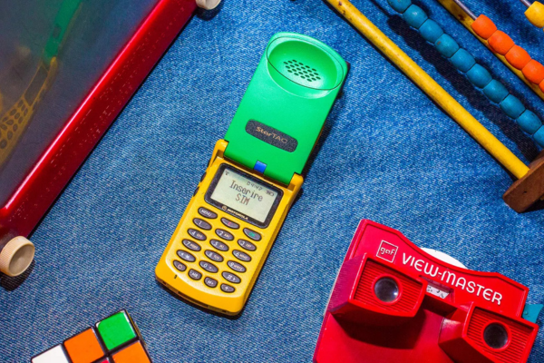
Persuasion is most powerful when it’s grounded in a narrative context. You can have the most stunning visual, but beauty without a compelling narrative doesn’t convince policymakers or anyone in a position of power to execute real change. Richard Buday, the author of the article “The Reality of Design Fiction: How Storytelling Can Save The World,” references a proverb that supports the previous statement perfectly. “What is truer than the truth? A Story.” Buday goes on to offer several pop culture examples that capture the essence of how films, stories, and novels that employed this philosophy moved the needle forward. My favorite example is how Star Trek showed us flip phones in 1964, and three decades later, Motorola sold its first flip phone, the StarTac. After understanding design fiction and how it’s a catalyst when it’s rooted in storytelling to persuade people, you can use a framework to create story-driven design.
Story-Driven Design: A Framework for Visual Coherence
More often than not, people think writers are the only creators who need to rely on a narrative to connect with an audience. This is false. Designers use storytelling to create meaningful user experiences that are memorable. Award-winning designer Chiara Aliotta has trademarked a five-step framework to enable designers to create visual coherence.
1. Understand Your Protagonist And The Purpose Of The Product
2. Define the Structure of Your Narrative
3. The Beginning
4. The Middle
5. The End
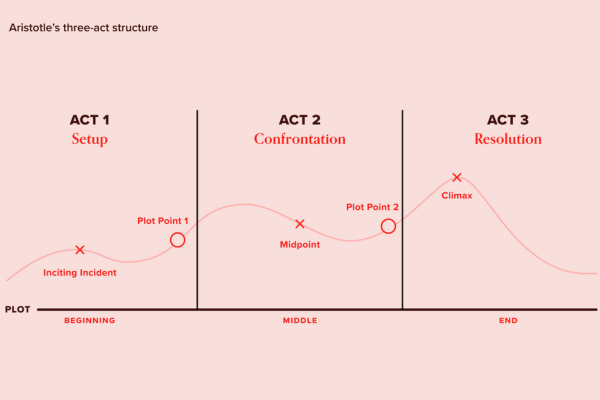
The second step of this framework supports the idea that combining Aristotle’s three-act concept with the “StoryBrand Structure” by Donald Miller, a philosophy that stories must be a chain of cause-and-effect moments, creates the most clear sense of continuity throughout any narrative.
One of the best examples I can think of to reference that supports this is the first season of the Netflix Original, “Stranger Things.” This is a sci-fi series based on a series of supernatural events that happen in a small town in Indiana, following a group of young friends who discover one mystery after another involving the government and supernatural forces.
The first season of Stranger Things is a perfect example of combining Aristotle’s three-act concept with the StoryBrand Structure because there are three clear acts with a cause-and-effect narrative.
Act I: One of the main characters, Will, disappears and initiates the first mystery (Setup)
Act II: The group of children meets Eleven, a child with psychic abilities who is a government experiment, and eventually discovers the “Upside Down.” (Confrontation)
Act III: The group of children confronts the Demogorgon (monster) and saves their friend Will, who went missing (Resolution).
Despite the fact that this is fiction, you can still leverage the hero’s journey to anticipate change and design future experiences that are a reality.
The Hero’s Journey as a Tool for Designing a New Reality
The hero’s journey is one of the most popular concepts that is not only a storytelling tactic but also used in design thinking and trend predicting. It’s a great tool for innovation in the design process because it grounds very abstract and complicated ideas into simpler stories that are relatable and puts the user in the spotlight.
Leah Zaid, an award-winning futurist, authored an article, How to Use the Hero’s Journey as a Design-Thinking + Foresight Tool, that details a simplified version of how you can conceptualize the hero’s journey as a designer to better understand your customers and target audience.
Learning about patterns in action to understand what a narrative arc, hero’s journey, and how to storyboard taught me how design fiction can be a catalyst for change. Once I knew more about the why behind this, I was able to shift my attention to story-driven design, specifically how to use it to turn speculation into a narration that’s compelling and emotionally relatable. Lastly, I reframed the hero’s journey and learned about its relationship with change and how to tap into it for user journeys to design future experiences that can become reality.
All of this leads me to believe that in our world of uncertainty, maybe the most powerful design tool we have is knowing how to tell a good story.
From the loud sirens, car horns, and hustle and bustle of working all day trying to grab a quick bite to eat at a street vendor outside of your city office, to the warmth of family laughter, smell of tomato sauce, and sitting at table bumping elbows waiting for an Italian family-style meal, food is a universal love language and no matter where you are, what you are eating, and who you are doing it with, there’s a story to tell.
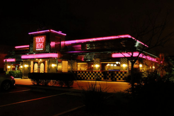
Restaurants serve as windows into culture, emotion, and authentically show us who people are and what they value. When it comes to diners, they serve as an American cultural icon of escapism. Maybe you’ve had a long night and want to indulge in that big omelet breakfast you couldn’t have because your boss needed you in the office early this morning, or you’re looking for somewhere to go on a Saturday night with your high school friends after the movies. The ambience of diners and this specific image lean into the second principle of visual storytelling, sensory. In a world that’s moving at a million miles a minute, the soft lights, cushioned booths, and brightly colored interiors create a sense of safety and reprieve. Let’s juxtapose this by looking behind the scenes of a restaurant.
It’s the responsibility of a restaurant’s staff to control the chaos by orchestrating a perfect culinary symphony. Customers don’t see the grueling number of hours line cooks and their teams put in to unpack deliveries, prep all day, do research and development to refine a menu, and everything else in between to create magical memories for patrons. This is a glimpse of the culmination of all those hours of grit, sweat, tears, laughter, and smiles. What you see in this image is a dramatic storytelling technique. There isn’t much to interpret, and we are completely absorbed in the action, the line cooks prepping food. Shifting gears, it’s time to look at another image that evokes a different feeling.
Finding your version of peace and quiet to start your day is one of the best things you can do to boost your mood. For lots of people, that’s grabbing a cup of coffee or tea at a café like this one. Designing a café with large windows to let lots of natural sunlight in and outfitting its interior with plants and warm earth tone colors creates a cozy mood. This is the kind of space someone would want to work remotely from. In visual storytelling, creating and capturing a “moment,” a fleeting bit of time that creates emotion and empathy, is one of the toughest things to do. This picture is focused on a very specific moment, the opening of this café.
A restaurant experience can be make or break based on the taste of your food and the service. Something that’s often forgotten about or pushed aside? The entertainment factor. Hibachi is one of those restaurant experiences that zeroes in on this. Whether it’s your birthday, a graduation, or maybe an anniversary, this type of restaurant’s main goal is to make you laugh, smile, and take a picture or video to show your friends what you did. The chef’s facial expression and the flame flaring up from the grill capture this emotion perfectly.
Grit and drive. Those are the first two words that come to mind when you see food vendors on popular boulevards in the downtown of a densely populated city or urban neighborhood. The composition of this picture goes beyond telling a story of just this woman grilling meat. The image gives you contextual clues that she’s in downtown Los Angeles based on following the rule of thirds. You can see the Roosevelt Hotel sign in the upper middle grid and a Hollywood star on the lower right-hand grid.
One of the most important visual storytelling concepts is to show, don’t tell. This picture is doing that perfectly. I immediately hear many conversations happening and the noise of a tin shaker pouring a new cocktail into a glass. The yellow, orange, and green colors exude a warm and approachable atmosphere that’s still chic. This picture gives enough context to viewers to think of what type of archetype would dine here. Someone who values higher quality food and beverage experiences, who is maybe trying to get away from their child to have a date night with their significant other. Turning the page, let’s look at one more restaurant picture.
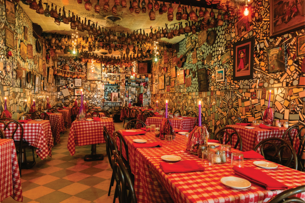
Generations Around the Table: Tradition in Every Fold
Generational depth and legacy are woven into the DNA of family-style Italian restaurants. The candles lit at each table, the red plaid tablecloth folded perfectly, this scene represents casual dining that evokes a friendly and homey feeling. This image follows a non-dramatic storytelling framework, created from different perspectives, and requires the audience to complete the picture themselves.
Restaurants, cafes, and food vendors around the world all carry human stories behind every meal and interaction. The smallest details, like the position of someone’s body, where their eyes are looking, and what’s on the table, are visual cues to what the mood of the moment is. When you consider elements of visual storytelling, including composition, sensory feelings, and whether it’s dramatic or non-dramatic storytelling, your connection to that photo is stronger, and you can create a full story to tell.