Author: kyleadams

  • Weathering the Storm: When in Doubt, Sketch it Out

    Image Source: Generated by Copilot


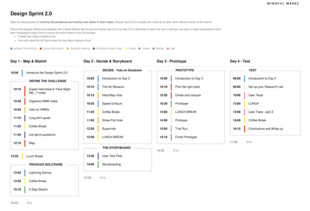
    After you’ve fully assessed a situation and have the context you need to create a target, set goals, and flesh out a few potential solutions, it’s time to switch gears to a mindset that’s ready to actively make decisions and dive deeper into the potential of each idea. Let’s explore what this leg of the journey entails when it comes to visiting the art museum, eliminating any assumptions and predispositions, and how you can visualize value before moving into the third phase, Prototyping.


    Take Your Time in Each Gallery


    When you’ve entered a museum, have you ever only looked at one painting in the gallery and then immediately turned around? Or go through an entire gallery without looking something up or asking someone a question? Probably not. When my team and I kicked off the beginning of Phase 2: Decide + Storyboard, the first thing we did was set aside a moment to have our team member Andrea give us an explanation of each solution sketch displayed within a frame of Miro and all of them were laid out in a horizontal row. Setting up Solution Sketches, like an Art Museum, gave everyone the ability to understand what each person was thinking about for PennyPal (our personal finance app targeting Gen Z consumers) and see how various MVP features coincide with one another.


    Creating an Art Museum during a Design Sprint relates to a museum trend I was reading about that’s helping people regain their lost attention. One specific point that I read about and saw happening during our Design Sprint was:

    “The other thing that happens in museums and galleries, she says, is that we take notice of the objects and the collections. That act of taking notice is all about being in the present moment.”

    Image Source: BBC


    I immediately noticed after we started the art gallery activity that eliminating distractions and holding space to sit with ideas helped us turn abstract ideas into connected concepts.


    Eliminating Assumptions & Predispositions


    Everyone’s experience using an app is different. Take Instagram for example. I might open the app, go to my message feature, send a DM to my friend, and then click the post button to publish a piece of content. Chloe, on the other hand, might open Instagram, go to the explore feed, watch a few reels, leave a comment on one, then send it to her friend as a message.


    When it came to choosing a User Flow for PennyPal, I was the decider. I tried my best to think about the experience holistically. Playing this role in the exercise reminded me a lot about the role I play in my current job every day. I work as an Associate Director of Digital Engagement at Quinnipiac University, and one of my responsibilities is managing a social media account with several profiles. Every day, I am a decider in choosing the content I am going to publish, using a pool of resources I have access to (campus updates, Alumni spotlights, Alumni events, etc.).


    Image Source: MakeUseOf


    The parallels between my role at work and my role as the Decider during the super voting for User Flows is captured perfectly in the book Sprint: How to Solve Big Problems and Test New Ideas in Just Five Days.

    “It’s important to note that this decision-making process isn’t perfect. Sometimes, Deciders screw up. Sometimes good ideas don’t get selected (at least, not in the first sprint). But the sticky decision – if not perfect – is pretty good and very speedy. That speed helps with the sprint’s larger goal: getting real world data…”


    As the person in charge of several social media profiles this is how I feel. The ability to be decisive to test and learn to collect real-world data to understand signals from our audience is crucial to our growth and success. Being in this role at work is like running a Design Sprint. It is an iterative process that loops back and forth.


    Visualizing Value


    The last part of this phase of the Design Sprint was Storyboarding. After our group selected a User Flow, it was time to sketch out what these micro interactions would look like within our app.


    For me, Storyboarding illustrated how our (hopefully millions of) Gen Z users can navigate through PennyPal in a way that makes it crystal clear if they will adopt using some of our main features like Budgeting, Goal Tracking, and Investing and if Gamification features with rewards will make them want to keep coming back for more.


    Storyboarding isn’t something only used in Design Thinking. Tons of the best businesses in all types of fields use Storyboarding to foster collective creativity. Take Pixar, for example.


    “Each of their teams typically consists of a director, writer, artists, and storyboard people. The development department’s goal is to find individuals who will work effectively together. During this incubation stage, you can’t judge teams by the material they’re producing because it’s so rough—there are many problems and open questions. But you can assess whether the teams’ social dynamics are healthy and whether the teams are solving problems and making progress.”

    Image Source: HBR


    My one takeaway from this statement about Pixar and after I went through Storyboarding is this process creates progress and pushes everyone and everything forward.


    I’m excited to see how these ideas will manifest into real-world tangible concepts that we can test as prototypes.

  • Walk Before You Sprint: The Overlooked Phase That Makes or Breaks Your Design Sprint

    Image Source: Generated by Google Gemini


    Where it all Started


    Before you and your team begin a Design Sprint, you need to take the necessary measures to make sure everyone is ready. With Design Sprints, there’s no such thing as overpreparation. Connecting with your team and client to onboard each person, define who is doing what, review the “run-of-show,” double check you have all the materials you need, and create several team agreements that are honored through the Sprint will guarantee its overall success.

    Let’s delve into a few of the steps I mentioned above to better understand the role each of these play in the preparation phase of the Sprint and how you and your teammates can contribute to each these tasks to get on the same page before beginning the Sprint itself!


    A Goal Without a Plan is a Wish


    If you want to achieve a certain outcome, you need to have an idea as to what your specific “challenge” is, and understand what and who it is going to take to solve it. With the Sprint process, you and your team use guard rails that serve as ground rules over the course of four days. Each day has several mini workshop sessions and the day itself has a theme, or an even better way to think about it is each day is broken out by one of the steps of the Design Thinking process. See the picture below to better understand what I am talking about.

    Image Source: Mindful Marks


    Why a Craftsman Needs to Sharpen Their Tools


    Before you, your team, and client begin the first day of the Sprint, make sure you have all the supplies all of you will need for the next four to five days. If you are running the sprint virtually and everyone is remote, you can rely on tools like Miro for digital whiteboarding, otter.ai to transcribe notes from each day of the workshop, and Zoom to host the meetings virtually and record all of them. If you are doing the workshop in-person instead, you’ll need to have lots of office supplies to whiteboard and brainstorm in-person including but not limited to stickie notes, sharpies/markers, masking tape, and time (to name a few).

    Image Source: AJ & Smart


    Roles & Responsibilities: Everyone Has One


    I’m sure you’ve heard the phrase teamwork, makes the dream work. As cliché as it may be, this is especially true when you’re working with a group to facilitate a sprint. Everyone’s role and the responsibilities that come with it need to be decided ahead of time for the Sprint to run smoothly. As explained in the Sprint Handbook: a step-by-step guide to planning and running innovation sprints, each of these roles play a unique and critical part in the success of a Sprint. See below for just a few!

    • Notetaker:  Captures essential information during interviews and discussions.
    • Lead Facilitator: Guides the overall direction and maintains focus of the sprint.
    • Sprint Host: Ensures a comfortable and productive environment for everyone.
    • Prototyper: Translates ideas into tangible prototypes.
    • Interviewer: Conducts user interviews to gain insights.


    Image Source: Workshopper


    There’s No “I” in Team: How to Compromise


    The most impactful concept I learned in this stage of Design Sprints is the importance of creating Team Agreements. During the mini workshop we conducted this week as a team, this was one of the three exercises we had to complete together. Doing this collaboratively, enabled each one of us to learn more about what each person in the group enjoys about teamwork, what they find challenging, and then create several agreements that we can all use to bring clarity, focus and good vibes for the next 6 weeks of work we will do together. Here’s a few of the agreements we made.


    Team Agreements

    1). Be on time to our weekly Friday meetings starting at 1 p.m. ET and let the group know by Wednesday if you can’t make it due to an extenuating circumstance.

    2). Keep phone on silent and/or do not disturb during our team meetings.

    3). Dedicate the first five minutes of the team meeting to “catching-up.”

    It’s not possible to over prepare for a Sprint Workshop. Preparing for a sprint Workshop is just like walking to warm up before running a race. Walking before running is often overlooked and an afterthought, but without it you’re ten times more likely to cramp up or maybe even pull a muscle. Metaphorically speaking, the same goes for preparing for a Sprint. Without all these layers of preparation you, your team, and client aren’t going to have a successful sprint. After preparation is complete, it’s time to move into the first phase of the sprint. Map + Sketch.

    Sources

    Belle Hastings, P. (n.d.). The Sprint Handbook: a step-by-step guide to planning and running innovation sprints.

    Knapp, J., Zeratsky, J., & Kowitz, B. (2016). Sprint: How to solve big problems and test new ideas in just five days. Bantam Press.

  • The Infinite Iterative Loop

    Image Source: Generated by Google Gemini


    When it comes to problem-solving, regardless of the issue, you must think creatively to come up with a solution. Usually, your first step is to get a grasp of the situation. After that, you move on to creating a hypothesis. Once you’ve created a hypothesis, you start generating ideas. Next, you develop a demo of what you are trying to produce, and lastly, you release a version out into the world for a set audience to test and utilize.

    These steps I just listed are the core components of Design Thinking, a type of problem-solving that focuses on human-first design using an iterative process. To better understand Design Thinking, we are going to look at its origins, examine the guiding principles of the sprint process, and uncover what types of problems sprints are great at solving.


    Where it all Started


    The roots of Design Thinking go back to the 1960s. What started as a novel concept grew into a widely embraced strategy that could not stop accelerating. Design Thinking became mainstream and solidified as an approach to innovation in the late 20th century. Several people and institutions played a role in its mass adoption. David Kelley, the founder of IDEO, a global design company, is credited for shaping and promoting the version of Design Thinking that millions of people use today.

    This new movement sought to redefine the design process, including how interdisciplinary creatives collaborated, the emphasis on empathy, and shifted focus on iterative problem-solving. After Design Thinking had proven its value through popularization and widespread usage, companies and individuals at the cutting edge of technology and innovation created the “Sprint.”


    This Time it’s a Sprint, not a Marathon


    One of the biggest byproducts of Design Thinking is the Sprint, a method that solves problems quickly and validates ideas in a compressed timeline of five days instead of several months. A Sprint is comprised of four guiding principles.

    • Working Together Alone: Sketch, ideate, and create on your own, then come back together.
    • Tangible Things Over Discussion: Focus on discerning, deciding, and getting ideas into the world as tests.
    • Getting Started Over Being Right: Embrace ambiguity. Become risk-tolerant.
    • Don’t Rely on Creativity: Leverage time-based exercises that use frameworks to ideate and create.


    When at a Crossroad, Which Path to Take


    When it comes to developing innovation and solving problems, many companies struggle with deciding when to run a Sprint or if it’s even worth doing so from a timing and resources perspective. The best thing to do, is remind yourself that running a Sprint allows you and your team to test ideas and learn quickly while minimizing the risk.

    Here are a few examples of when it’s best to run a Sprint!

    1. When starting a new project.
    2. When seeking to improve an existing product or process.
    3. When seeking user validation.
    4. When fostering collaboration and team alignment.


    Design Thinking and the facilitation of a Sprint are iterative processes that are infinite, just like a loop. Even after you launch your product to market, even if you solved the original problem that was defined, it’s more likely than not you’ll have a new problem to solve or a specific thing your users want to see improved. Starting the Design Thinking and Sprint process all over again.


    Sources

    Belle Hastings, P. (n.d.). The Sprint Handbook: a step-by-step guide to planning and running innovation sprints.

    Knapp, J., Zeratsky, J., & Kowitz, B. (2016). Sprint: How to solve big problems and test new ideas in just five days. Bantam Press.

  • New Haven Pickleball’s Brand Promise: More Than Just a Game

    Image Source: Photograph taken by Steve Walter

    At its core, all brands are a promise. Usually, the first thing that people picture when they hear the word “brand” is a logo, colors and some type of slogan. Gathering all these components together to tell people a story and effectively communicate whatever good or service you are selling is how you succeed in creating a successful brand that changes someone’s life. Taking this visual design course taught me to think about branding holistically from the perspective of a designer. Specifically, how every little decision whether it’s using a chunky serif font to evoke an assertive tone, choosing a balanced trio of colors, or creating a certain style of illustration on product packaging to target an audience; all these decisions add up to the total sum of what makes a brand memorable.  

    The culmination of these design skills I learned over the last seven weeks is on display in the new brand guidelines I designed for New Haven Pickleball. This is a community to connect with local, fellow pickle-ballers. No matter if you are brand new to this brilliant game or prepping for the day it is in the Olympics, you are welcome! I discovered this community in the summer of 2024 and almost one year later, have met many incredible people that I play Pickleball with regularly. Creating brand guidelines for New Haven Pickleball was a fun, yet challenging process since the brand had no foundation to work off besides a name and a few social media pages. I’m going to take you through an aspect of the brand guidelines that is one of the most vital components to making this brand what it is.

    Verbal Brand

    Regardless of the company or organization, the anatomy of all brands has a verbal brand component. For New Haven Pickleball, all it had was name. When you really think about it, a verbal brand is so much more than a name, it’s your company’s slogan, personality, tone of voice, and style of language.

    After reading a chapter on branding from the book “Graphic Design For Everyone” by Cath Caldwell, I understood what all of these parts of a verbal brand meant. After thinking, research, and some trial and error, I decided to change the name of this company to NHV PB, created the slogan “Community > Competition”, and established its values are inclusivity, positivity, learning and passion.

    These decisions about NHV PB’s verbal brand set the tone moving forward for the copy I used on marketing collateral including an event poster, brochure about the spring league, and a home page design comp for a website mockup.

    The slogan, “Community > Competition” might be the most important aspect of NHV PB’s verbal brand. This company is mainly a community. The “good” it sells is the sense of belongingness, camaraderie, and the opportunity to consistency play pickleball. Using this phrase as a slogan that appears on print collateral, merchandise, and digital properties echoes inclusivity as a brand value and welcomes players at all levels while still validating the legitimacy and opportunity to progress and get better at pickleball.

    I look forward to learning more about visual design and the opportunity to potentially work with the league manager who created New Haven Pickleball to implement some of these brand guidelines.


    Sources

    Caldwell, C., & Skene, R. (2019). Graphic design for everyone: Understand the building blocks so you can do it yourself. Dorling Kindersley Limited.

  • From Lens to Canvas: Crafting Emotional Connections in Design

    Image Source: Generated by Google Gemini

    Conveying information to elicit an emotional response is one of the most powerful skills a designer can master. From photos to hand-drawn illustrations and even digital artwork, each form of imagery is a core component of graphic design. Something that stood out to me in this learning module is the juxtaposition of Illustration and Photography. Specifically, what illustrators can convey vs. photographers, the factors in the decision process illustrators go through when choosing a style, and the intersection of goals illustrators and photographers share. Let’s dive in!


    Photography: Capturing the Moment

    Photography is your best friend if you are trying to visually depict a product, establish a mood, and ultimately build a relationship with your target audience. A few of the most practical outcomes that photography creates for graphic designers are the ability to sell a product, establish trust, tell a story, or teach a technique.

    For my semester-long brand project, I am working on creating a visual and verbal “Brand DNA” for New Haven Pickleball, a local pickleball community I am part of. Using photography that captures pictures of people serving, dinking (a light touch hit in pickleball), and drop shots can showcase the wide variety of shots in pickleball and teach members of this community proper form for these different types of shots.


    Illustration: Carefully Crafted

    Illustration is typically a form of art that depicts a product or location. One of the most valuable aspects of illustration is its ability to convey abstract concepts. Because of its versatility, illustration usually enables designers to reach their target audience in ways that photography typically can’t. A few of the best examples are creating reality with personality, showing how, revealing what lies beneath, imagining prehistory and fantasy, and visualizing a complex idea.

    Continuing with the example of the New Haven Pickleball organization that I am doing my “Brand DNA” project on, creating an illustration to showcase different types of paddles and the various materials that make up a pickleball paddle and how they impact the type of play style it favors, would be a great example of how an illustration would work best instead of a photo.


    The Decision Tree: Differences & Similarities

    If you’ve identified wanting to use or create an illustration for your brand/company, there are a few essential things to consider. The purpose of the illustration, its overall brand (mood, tone of voice, being reflective of the brand’s personality), understanding who your audience is, and the medium that your illustration is being designed for (where most of your audience is viewing it). I would likely choose a freehand digital style for any illustrations for New Haven Pickleball because it would enable me to use the brand colors freely which range the spectrum from bright to dark. This would also help me evoke the brand’s chatty and informative personality without being forced to use an illustration style that comes off as childish, luxurious, or serious, which wouldn’t appeal to most of my target audience.

    For photographers, the decision-making process looks a bit different. After a photographer decides what they’re shooting as a subject and are ready to go, they need to consider the following factors to get the best composition that’s appealing and impactful; fitting the format to the subject (deciding if horizontal or portrait format makes sense), using the rule of thirds, considering the background, and using lines to lead the eye. If I were shooting some pictures for New Haven Pickleball, I would use a portrait or vertical frame for photos of a pickleball paddle to capture its entire length. I would also capture some low-angle shots from the ground and use the court lines to lead the viewer’s eye to showcase some photos of people playing a game of pickleball in an interesting way.

    Anyone can take a photo or create an illustration, but getting the most out of either form of imagery is crucial to being a successful designer who knows how to tell a brand’s story and convey its emotion. I hope you learned a bit about the differences between photography and illustration and how both can elevate your brand and take it to the next level.


    Sources

    Caldwell, C., & Skene, R. (2019). Graphic design for everyone: Understand the building blocks so you can do it yourself. Dorling Kindersley Limited.

  • The Complexity of Colors Doesn’t Need to be Confusing

    The Complexity of Colors Doesn’t Need to be Confusing

    One of the most powerful skills a designer can master is the use of color, specifically the selection and manipulation of color to elicit a particular emotion out of someone. A vast amount of research has proven there’s a consistent response people have to different colors. For instance, yellow evokes feelings of happiness, warmth, and positivity, which makes it a perfect choice for a brand like McDonald’s to leverage and use one of the most popular yellow graphic devices (a smiley face). They also incorporate yellow as a primary choice in their branding, complemented by red to evoke hunger.  

    To fully unpack color psychology, I’ll use yellow as an example to explain the positive and negative feelings it conveys, what personality the color embodies, and examine how a brand uses it to connect with its target audience.

    Image Source: SeekLogo

    Context & Foundation

    According to Wikipedia, Color Psychology is the study of colors and hues as a determinant of human behavior. A hue is a color in its pure form, without tinkering with the shade, tint, or tone of the color to add neutral colors like black, white, and grey to brighten or darken it.  

    Another helpful aspect in understanding why a color conveys specific positive and negative emotions is that all colors convey two types of meaning that influence a person’s preferences and behaviors. Referential meaning, which is learned and usually reliant on environmental context, and embodied meaning, which is independent of environment, typically put into effect when exposed to a color.  

    A great example of referential meaning is when you see yellow on a street sign, you immediately associate it with a potential hazard/danger because of the context. A relatable example of embodied meaning in regard to yellow is warmth because that’s what we all see as the color of the sun.  

    Image Source: Kate Green Designs

    Eliciting Emotions

    When examining the color wheel, the spectrum shows 12 sections of different colors and their relation to each other. Yellow is one of the three primary colors, meaning it can’t be created by mixing other colors.  Because of yellow’s referential and embodied meanings, it’s classified as a warm color, and warm colors are associated with energy, brightness, and action. On the other end of the spectrum, yellow is known for fear, caution, and anxiety. A perfect example of yellow’s negative emotion and its application in the world is yellow being used to signal slowing down at a traffic light. Now that we know more about this color and its spectrum of emotions let’s see how this shapes its personality. 

    Image Source: Verywell Mind

    Personalities can be Polarizing

    Despite the fact that yellow represents warmth and energy, the intensity of it can also come off as aggressive and even confrontational. Brands typically utilize yellow to tap into the positive feelings I mentioned. In addition to McDonald’s, one of the better examples is the chain Denny’s, which is known for its breakfast offerings and trying to get customers in the “Rise and shine” mindset at the start of the day.

    Learning about the psychology of color and how every color plays a unique role in branding has been incredibly helpful in building a brand that’s more relatable to my target audience. I’m excited to apply what I’ve learned about color to evoke an energetic, welcoming, and passionate personality for this pickleball community.  

  • Evoking Emotions Through Writing: Why Typography is Branding’s Unsung Hero

    Image Source: Canva Dream Labs AI Generator

    Every day, the average person reads about a dozen different typefaces. Whether it’s a billboard for a new business that opened in your neighborhood, the recipe for a meal in a cookbook, or a television broadcast of your baseball team. Typography is one of the most powerful tools to convey emotion. Although it’s something most people seldomly think about in terms of understanding its core components and how to use it to convey specific moods, it is one of the most powerful tools a designer can have in their arsenal.

    After thinking about this week’s readings, videos, and assignments, I’m going to delve into the anatomy of type, explaining how several core components make up a typeface and ultimately the mood it conveys.

    Every Major Cog in the Machine

    After reading the first section of chapter 2: building blocks in the book, “Graphic Design for Everyone” it started to click for me. Just like the technology we have that uses lots of parts to make a device work, Typography has a nuanced anatomy with various components that make up its structure to create different typefaces. I’m going to teach you about three different components that make up the structure of a Typeface for you to better understand how designers can manipulate these things to create different typefaces.

    Ascenders

    The first component I want to examine is the ascender. An ascender is the part of the lowercase letter that extends above the x-height (the height of a font’s lowercase x). If a designer selects a font with high ascenders, it’s usually because they want a letter to be easily distinguishable. You’ll see this often with book titles, such as the example pictured below which would be used as a font for a fantasy book.

    Image Source: Creatype Studio

    Bowls

    The next component we’re going to look at is a bowl. This is the curved stroke that creates an enclosed space. This is a significant element of type design because the size, curvature, and proportions of the bowl can vary significantly depending on what typeface you’re using. A great juxtaposition to look at to better understand the bowl, is comparing the letters R and B and this article titled Typography design 101: a guide to rules and terms” explains it perfectly.

    “The letters B, P and R are sister shapes, one being derived from the other. However, that doesn’t mean they have the same proportions. The bowl of the R needs to be slightly thinner so that when we connect the leg to it, it won’t become super thick. While the upper bowl of the B needs to be smaller than the bottom one, so that the letter appears more stable.”

    Image Source: 99Designs

    Serifs

    One of the most prevalent components in all typefaces is the presence or absence of a serif, a small, decorative extension at the ends of some strokes. This component defines whether a typeface is a serif type, or sans serif type. Serif types have this decorative extension and sans serif types do not. When you compare the two next to each other you can immediately tell a different mood is set. Serif typefaces typically look authoritative, professional and serious. Sans serif typefaces are usually quirky, whimsical and fun. Choosing these your typeface wisely based on your brand’s essence and expression can make or break your brand in terms of how it resonates with your intended target audience.  


    Although typography is the unsung hero when it comes to what the average person thinks of when they hear the word branding, understanding it and mastering it is one of the most useful skills a designer can build.

  • The Anatomy of Brand DNA

    The Anatomy of Brand DNA

    Staring at a blank canvas is overwhelming. Usually, we have an idea but taking a concept and turning it into reality to “get started” is where we have the most difficulty.

    This week, I learned about the different components of understanding your brand and why spending countless hours planning and researching will save you agita in the long run during the design phase.  Two concepts stood out to me the most and I want to emphasize why I think each of them is equally important in the world of branding.


    Brand Expression

    When it comes down to creating a brand plan there are four main stages in this process. Understanding the difference between creating your verbal brand and visual brand is paramount.

    When defining your verbal brand, you need to answer questions like:

    • What’s your brand’s summary line descriptor?
    • If you would describe your brand like a person with personality traits, how would you describe your brand?
    • If your brand were a person, how would it speak?

    Going through this consideration set with the New Haven Pickleball League, a small organization I am re-branding, I was able to establish the fact its tone of voice is chatty and informative, its values are inclusivity, positivity, an always learning mindset and passion, and its summary line is “Community over Competition.”

    Completing this exercise gets you one step closer to defining who your brand is and what audiences you want to connect with. After this, you can start to address the other side of the coin, visuals.


    Brand Essence

    Creating a visual language to convey the identity of your organization is a meticulous process. Collecting colors, images, and typefaces to make a mood board helped me organize my thoughts and start to think through what is central to the branding of the New Haven Pickleball League and figure out what’s that common thread that holds it all together.

    Selecting visuals that connect to your verbal brand and convey the words you chose that represent your brand is how you move forward in the design process to the fourth and final stage, development.

    Adaptable Aesthetics was at the top of mind while I was creating several versions of my logo. I used a combined mark with typography that conveys motion and unity (two constants in the world of Pickleball for all players). I also prioritized simplicity for my logo to work well in any context (business cards, water bottles, backpacks, apparel, etc.).

    Learning about the juxtaposition of a brand’s expression (verbal Language and positioning) and essence (visual language) has taught me how to use brand and design terminology, conduct research, and design brand components.

    An important distinction I took away from everything I’ve read and created this past week is that a logo is not a brand. It’s a unique design or symbol that represents an organization. A brand distills the nature of the experiences that consumers have when they come in contact with your business.

    I’m looking forward to delving deeper into typography over the next week and learning how it influences branding and visual design.

  • Why Social Media is The Best Trailer for Writers

    Image Source: Generated by Google Gemini

    If a tree falls in the forest and no one is around to hear it, does it make a sound? This metaphor can also be applied to releasing a long-form article on your blog.

    All great writers build a reputation on social media to connect with their audience and promote their work. Social media is part of the marketing mix and a necessary level of the funnel to get your customer (reader) to land on your website and read your article.

    Here are three social media post mock-ups teasing my upcoming article, “Social Media’s Obsession With Caffeine: The Reality of Consumption & Its Effects.”


    Instagram


    As attention spans shrink and more people are interested in entertaining and educational content that will stop them in their scroll, it’s vital to have eye-catching visuals for your Instagram post.

    In addition to using a futuristic dramatic visual that’s almost dystopian in some ways, I focused on making my caption short and pithy to motivate my followers to engage with the content.

    I encouraged them to read the article through the link in my bio since you can not hyperlink websites in Instagram captions.

    Now, I want to show you how I will promote this content through X.


    X

    For this post on X, I kept the tone very conversational by asking my followers a relatable question to start the post. After I posed the question, I transitioned to making a bold claim that poses a statement I know people will have different opinions on.

    The end of this post has several emojis to add some emotion and keep it casual. I used a pointing down finger emoji to act as a clear CTA. My followers can click that to read the article or click on the asset, the header image pre-populating my article.


    LinkedIn


    When I went to create this post for LinkedIn, I knew the tone of my copy would have to be slightly more serious. I wanted to focus on educational content that adds value while creating a hook that is a personal and relatable experience many of us have gone through.

    This hook is intriguing. Most people have had this thought. And if they haven’t, they are immediately curious to figure out what I’m talking about.

    Quantifying your opinions and research is popular on LinkedIn. When you have a number attached to your post, it validates you as a thought leader and trusted source.

    Social media posts are one of the most effective tools in the marketing mix to lead readers to long-form articles.

    I hope this encouraged you to read my long-form article, and I look forward to hearing your thoughts about it!

  • Everything Good Doesn’t Have to Come to an End: Want to Know Why?

    Everything Good Doesn’t Have to Come to an End: Want to Know Why?

    Image Source: Generated by Google Gemini

    You’ve probably heard the phrase, everything good must come to an end. But what if I told you I disagree with that phrase? This famous proverb is an undertone used often in movies and television to express regret when something that brings you happiness ends. It’s also used to accept that even enjoyable experiences cannot last forever.

    When it comes to writing well, I believe there’s an exception to this proverb. Instead of focusing on the proverb’s literal meaning, the best writers take it one step further.

    The best writers prioritize leaving their readers with one provocative thought. Even if that “good” thing does end, writers cleverly do two things to get to this point with their readers.

    It’s as Easy as ABC

    Good writing knows how to spot the difference in scenarios with writing for the ear vs. writing for the eye. Writing for the Ear Instead of the Eye, an article by Jill Swenson, explains this concept perfectly.

    “Writing for print addresses the intellect: the intent is to communicate an idea or present the facts and let the reader infer the meaning and significance of the words. When you write for the ear, you want to evoke an experience, a set of sensations in the listeners.”

    Rhythm and alliteration matter for every sentence. As soon as you incorporate these things into your writing, you’re one step closer to having your readers hooked. There’s one more thing that can help you as a writer.

    Everyone Needs an Anchor

    Using unity to keep the reader from straggling off and satisfying their subconscious for order is the foundation of good writing. There are lots of variables you can choose as a writer to infuse unity into your writing. William Zinsser in his book, On Writing Well, explains this with the example of the unity of mood.

    “You might want to talk to the reader in the casual voice that The New Yorker had strenuously refined. Or you might want to approach the reader with a certain formality to describe a serious event. Both tones are acceptable. In fact, any tone is acceptable. But don’t mix two or three.”

    Everything good does come to an end, but that doesn’t mean you can’t harness the power of good writing to leave people wondering. Wondering about that new, provocative thought you left them. And wanting to read the next thing you write. Knowing how to write for the eye vs. ear and using unity are the first two steps.